I will be honest with you. I spent three weekends last summer staring at paint swatches taped to my garage wall. Three weekends. My neighbors probably thought I’d lost it.
But here’s what I learned through that painful process: choosing paint colours for outdoors is not like picking a shade for your living room. You cannot just find a pretty color and hope for the best. The sun hits differently at 7 AM than it does at 4 PM. Your roof has an opinion. Your landscaping has an opinion. Even the house across the street has an opinion.
So if you are about to make this decision (and yes, it is a decision not just a trip to the hardware store), let me save you some pain.
The White Farmhouse Is Dead. Long Live Beige.
Okay, maybe “dead” is dramatic. But the numbers don’t lie.
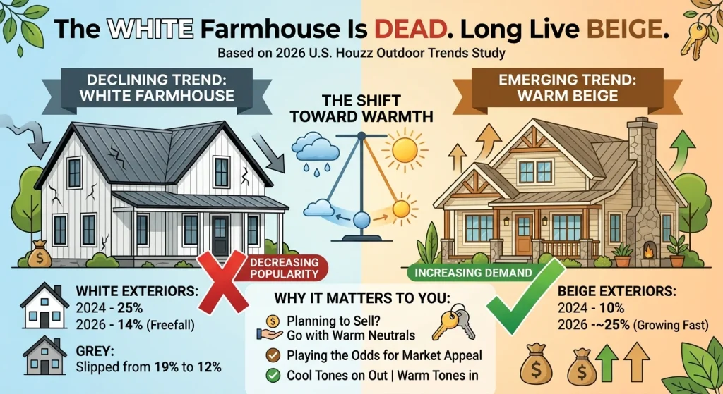
According to the 2026 U.S. Houzz Outdoor Trends Study, white exteriors have been in freefall. In 2024, about 25% of renovated homes went white. By 2026? Just 14%. That’s a steep drop for a colour that ruled exterior design for nearly a decade.
Grey did not fare much better. It slipped from 19% to 12%.
So what’s taking their place? Beige. Yes, really.
Nearly a quarter of homeowners in that same study chose beige for their exterior in 2026. Two years ago, that number was 10%. The pendulum has swung hard toward warmth, and honestly? It makes sense.
Here’s why this matters to you: if you’re planning to sell in the next few years, going with a warm neutral is playing the odds. Cool tones are on their way out. Warm tones are where the market is heading.
What’s Actually Working Right Now In Paint Colours for Outdoors
Warm Neutrals That Don’t Feel Boring
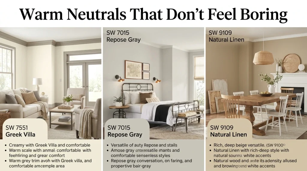
I know “beige” sounds like the colour of yawns. But the beiges of 2026 are not your grandmother’s beige. They are creamy, layered and surprisingly rich.
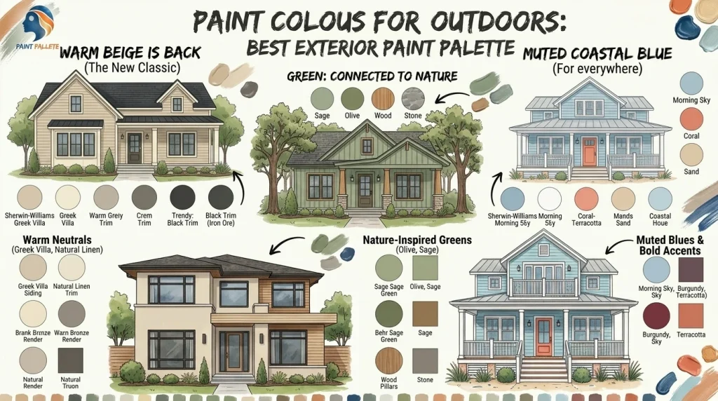
Take Greek Villa (SW 7551) from Sherwin-Williams. It’s a soft cream that reads almost white in bright sun but has enough warmth to avoid feeling sterile. Pair it with a warm grey trim and you’ve got a classic that won’t feel dated in five years.
Then there’s Repose Gray (SW 7015). Despite the name, it leans warm. It’s the kind of colour that looks different on every house sometimes grey, sometimes greige, always good.
And if you want something with a bit more depth, Natural Linen (SW 9109) is a deep beige that works beautifully with white trim and natural wood accents.
Greens That Belong Outside
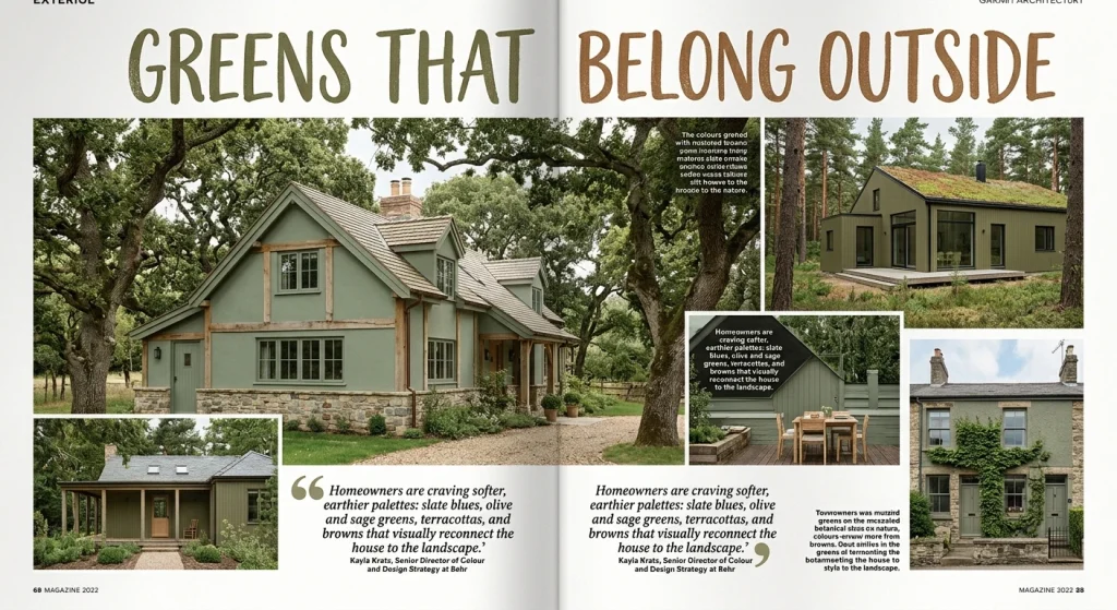
I will admit it: I was skeptical about green exteriors at first. It felt risky. But after seeing a sage green cottage nestled against a backdrop of oak trees, I got it. Green doesn’t compete with nature. It complements it.
Kayla Kratz, senior director of colour and design strategy at Behr, put it better than I could: “After years of white-colored farmhouses and icy gray facades, homeowners are craving softer, earthier palettes: slate blues, olive and sage greens, terracottas, and browns that visually reconnect the house to the landscape.”
That word — “reconnect” — is key. A green exterior doesn’t shout at the landscape. It sits within it.
Sage greens, olive tones, and muted botanical shades all work well. They’re particularly stunning on homes with timber or stone features.
Muted Blues for the Coast (and Everywhere Else)
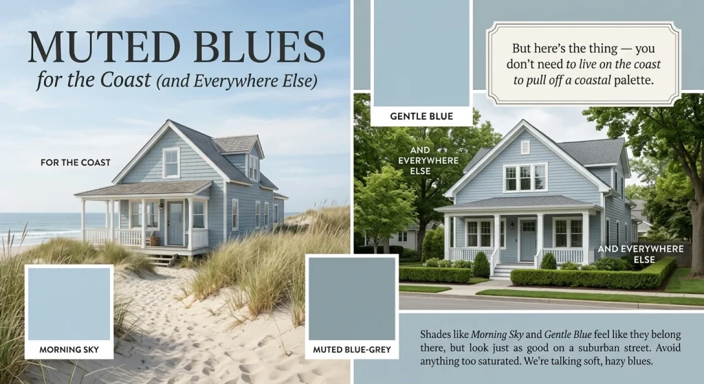
If you live near the water, muted blue-greys are almost a no-brainer. Shades like Morning Sky and Gentle Blue feel like they belong there.
But here’s the thing — you don’t need to live on the coast to pull off a coastal palette. A soft blue-grey exterior with crisp white trim looks just as good on a suburban street as it does on a beachfront property.
Just avoid anything too saturated. We’re talking soft, hazy blues, not electric blue.
Accent Colours That Actually Add Something
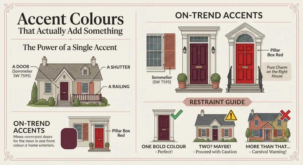
You don’t have to paint your whole house a bold colour. Sometimes a single accent — a door, a set of shutters, a porch railing — is all you need.
Terracotta is having a moment. So is burgundy. Sommelier (SW 7595) is a rich, luxurious burgundy that makes a front door feel like an invitation. And Pillar Box Red? It’s bold, yes. But on the right house, it’s pure charm.
The trick with accents is restraint. One bold colour. Maybe two if you’re feeling brave. More than that and your house starts to look like a carnival.
The Black Trim Thing (And Why It Works)
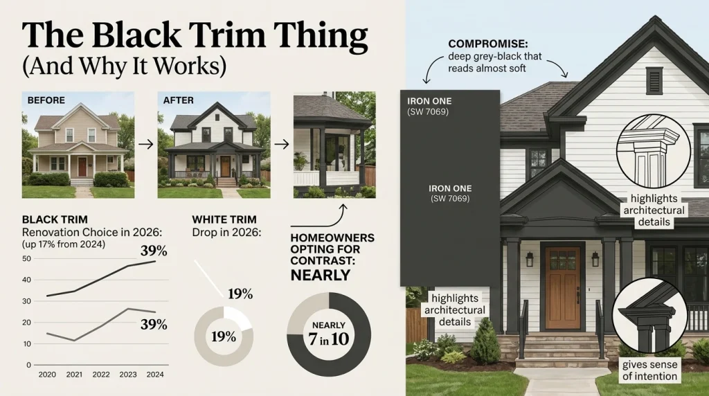
Here’s a stat that surprised me: 39% of homeowners renovating their exteriors in 2026 chose black trim. That’s up 17 percentage points from 2024. White trim? It dropped to 19%.
Black trim is everywhere. And you know what? It works.
Nearly seven in ten homeowners are now opting for contrasting trim and wall colours. The contrast creates depth, highlights architectural details, and gives even a simple house a sense of intention.
If black feels too harsh, try a deep charcoal or an iron ore tone. Iron One (SW 7069) is a deep grey-black that reads almost soft in the right light. It’s a great compromise.
How to Not Mess This Up
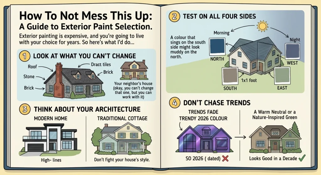
Look, I’m not going to pretend this is easy. Exterior painting is expensive, and you’re going to live with your choice for years. So here’s what I’d do if I were starting over:
Look at what you can’t change. Your roof. Your stone. Your brick. Your neighbour’s house (okay, you can’t change that one, but you can work with it). These are your constraints. Your paint palette has to live with them.
Test on all four sides. I cannot stress this enough. Paint large swatches — at least a square foot — on every side of your house. Watch them from morning to night. A colour that sings on the south side might look muddy on the north.
Think about your architecture. A modern home with clean lines can handle high-contrast schemes. A traditional cottage might want something softer. Don’t fight your house’s style.
Don’t chase trends. I know I just spent 800 words telling you what’s trending. But trends fade. A warm neutral or a nature-inspired green will still look good in a decade. A colour that’s “so 2026” might not.
The Short Version
The best exterior paint palette right now is warm, grounded, and connected to its surroundings. Beige is back. Greens are in. Black trim is the new white trim.
But more than any specific colour, the best palette is one that works with your home — not against it.
Take your time. Test your swatches. And maybe don’t spend three weekends on it like I did.