I’ll be honest with you. The first time I painted a wall amber, I panicked. Halfway through the first coat, it looked like someone had smeared pumpkin puree across my living room. I almost grabbed the white paint to cover it up.
Thank God I didn’t.
Once it dried and I pushed the furniture back, that wall transformed the entire room. Suddenly my boring beige living space felt like a warm hug. My neighbour walked in and literally said, “What is this colour? I need it.”
That’s one of the best things about amber paint colors. After experimenting with more amber shades than I care to admit (my garage is basically a paint museum at this point), I’ve learned which ones work and which ones… don’t.
Let me save you the trial and error.
What Even Is Amber Paint Colour?

Here’s the simple answer: amber sits right between yellow and orange. Picture honey, maple syrup, or that golden-hour light that transforms everything into magic. That’s amber.
The technical hex code is #FFBF00, but honestly? Amber paint shades range everywhere from pale, buttery yellow to deep, rusty orange. Some lean brown. Some lean gold. Some have a surprising hint of red that catches your attention.
That’s what makes amber so fun. You’re not stuck with one look.
Why Amber Makes You Feel Something (The Psychology Bit)
I’m not usually one for colour psychologists’ talk. But amber is different.
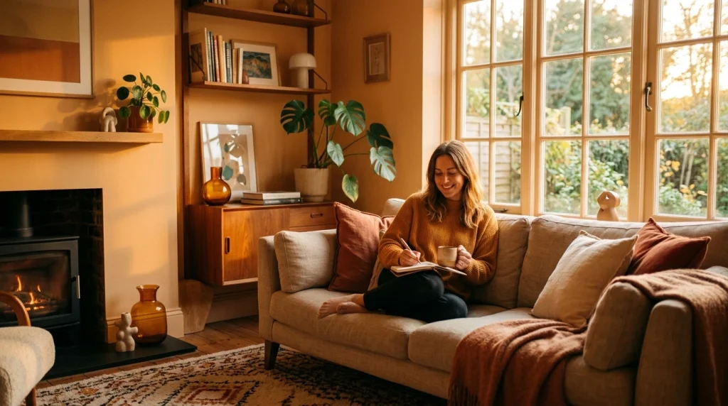
There’s actual research behind this phenomenon. Amber tones trigger feelings of warmth and comfort because they mimic natural sunlight. Your brain literally associates these colours with safety, cosiness, and the golden glow of late afternoon.
Ever notice how everyone looks better in golden hour lighting? Amber paint does the same thing for a room. It makes spaces feel lived-in and loved.
Designers also love amber because it sparks creativity without being aggressive. Unlike red (too intense) or yellow (too bright), amber finds that sweet spot. Energising but not overwhelming.
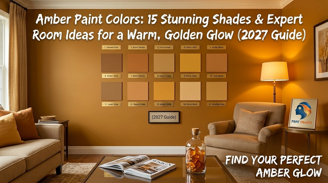
15 Amber Paint Shades I’ve Actually Tried (Or Seen in Person)
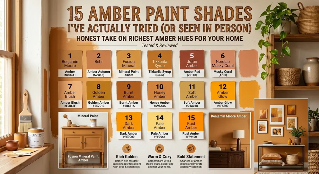
Look, I’m not going to pretend I’ve painted with every single amber on the market. But I’ve tested enough, and I’ve stood in enough paint stores staring at swatches to know what works. Here’s my honest take on 15 shades worth considering.
1. Benjamin Moore Amber (#C68341)
This one’s a classic for a reason. Rich golden-brown without being muddy. I used this in a client’s home office, and she told me it’s now her favourite room in the house. Pairs beautifully with dark wood furniture.
2. Behr Amber Autumn (S290-5)
Warm, golden beige that screams fall. Behr actually recommends this for gallery walls with turmeric and gold artwork. I’ve seen it in a dining room with cream trim, and it looked expensive. Like, “I hired a designer” is expensive.
3. Fusion Mineral Paint Amber
This one has rust undertones that give it an antique vibe. It’s gorgeous on furniture, especially if you’re into that vintage, farmhouse aesthetic. The brand calls it “familiar yet elevated”; I’d agree.
4. Tikkurila Syrup (S396)
Warm and rich, this amber almost feels like caramel. Tikkurila suggests pairing it with linen fabrics and brown leather. I’ve seen this combo in a bachelor pad, and it looked unexpectedly sophisticated.
5. Jotun Amber Red (20118)
Mild reddish amber with hints of terracotta. This one’s interesting because it reads almost pink in certain lighting. Works surprisingly well with peach, greens, and even reds. Bold choice, but it pays off.
6. Nerolac Musky Coral (4730)
Soft amber that’s easy on the eyes. This shade works in almost any room because it doesn’t try too hard. Perfect for open-plan spaces where you want warmth without committing to something intense.
7. Amber Blush (#F0B67F)
Delicate and soft. This is amber for people who are scared of amber. It has pink undertones that make it feel romantic. Great for bedrooms and bathrooms.
8. Golden Amber (#BE7C13)
Deep and saturated. This is a statement shade. Use it on an accent wall or cabinets if you want people to walk in and go, “Whoa.” Because they will.
9. Burnt Amber (#BB651A)
Darker amber with rusty brown vibes. This one feels moody and sophisticated. I’d use it in a study or dining room where you want drama.
10. Honey Amber (#D98A3A)
Sweet and cheerful. This shade lives up to its name. This colour looks stunning in kitchens and breakfast nooks alike. It just feels happy.
11. Soft Amber (#D1A04B)
Muted and earthy. This one feels organic and grounded. Pairs beautifully with wood, linen, and stone. If you’re going for that natural, earthy aesthetic, start here.
12. Amber Glow (#FFA800)
Vibrant and energetic. This is Amber turned up to eleven. Use it sparingly. A little goes a long way.
13. Dark Amber (#FE9C00)
Bold and saturated with strong orange undertones. That’s not for the faint of heart. But if you want a statement, this delivers.
14. Pale Amber (#FFD968)
Light and airy. This is basically a warmer version of yellow. Great for spaces where you want warmth but need to keep things feeling open.
15. Rust Amber (#FF9400)
Fiery and vintage. This one feels retro in the best way. Pairs stunningly with deep greens or charcoals.
Where to Actually Use Amber Paint Colour
Living Room
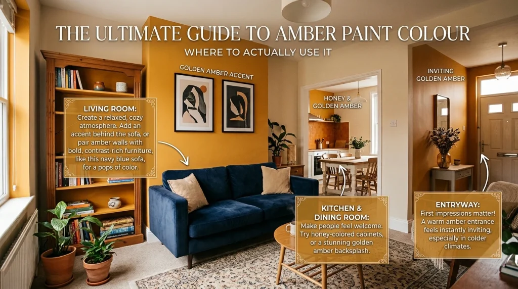
This is where amber shines. Reddish amber tones create this relaxed, cosy atmosphere that makes people want to sit down and stay a while. Try an accent wall behind your sofa. Or go bold and paint the whole room, then use creamy white trim to balance it out.
I painted my own living room in a golden amber and paired it with navy blue furniture. Sounds weird, right? It looked incredible. The contrast made both colours pop.
Bedroom
Go softer here. Amber blushes, or pale amber, work beautifully in bedrooms because they’re warm without being intense. Layer in linen bedding, wood furniture, and soft lighting. You’ll sleep like a baby.
Kitchen and Dining Room
Amber makes people feel welcome. That’s why it works so well in kitchens and dining spaces. Honey, Amber on cabinets? Gorgeous. Golden Amber as a backsplash? Unexpected and stunning.
Behr’s Amber Autumn is particularly lovely in dining rooms. Whether you’re into farmhouse style or clean minimalism, it works.
Entryway
First impressions matter. A golden amber entryway feels instantly inviting, especially in colder climates. It’s like your house is saying, “Come in, it’s warm here.”
Home Office
Remember how amber sparks creativity? Use that. Paint one wall or built-in shelving in amber to boost inspiration without distracting you. I’ve seen this work wonders in creative studios.
Colours That Play Nice with Amber
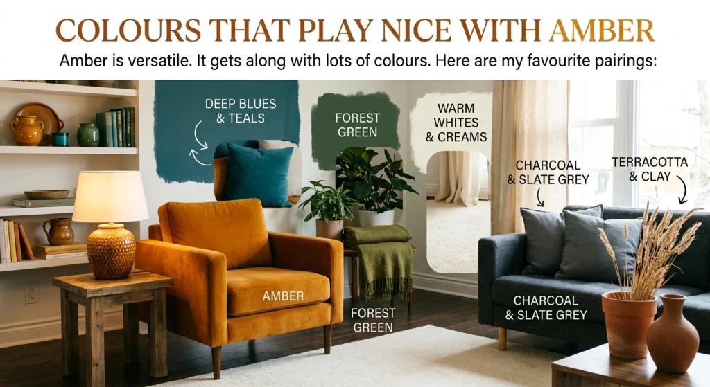
Amber is versatile. It gets along with lots of colours. Here are my favourite pairings:
- Deep Blues and Teals: Blue sits opposite amber on the colour wheel, so both create natural contrast. This combo is chef’s kiss.
- Forest Green: Earthy and sophisticated. Green grounds amber’s warmth and adds an organic feel.
- Warm Whites and Creams: Soften amber without killing its vibe.
- Charcoal and Slate Grey: Cool greys add structure and a modern edge.
- Terracotta and Clay: Deepens amber’s natural feel for a rich, grounded palette.
Questions People Actually Ask About Amber Paint
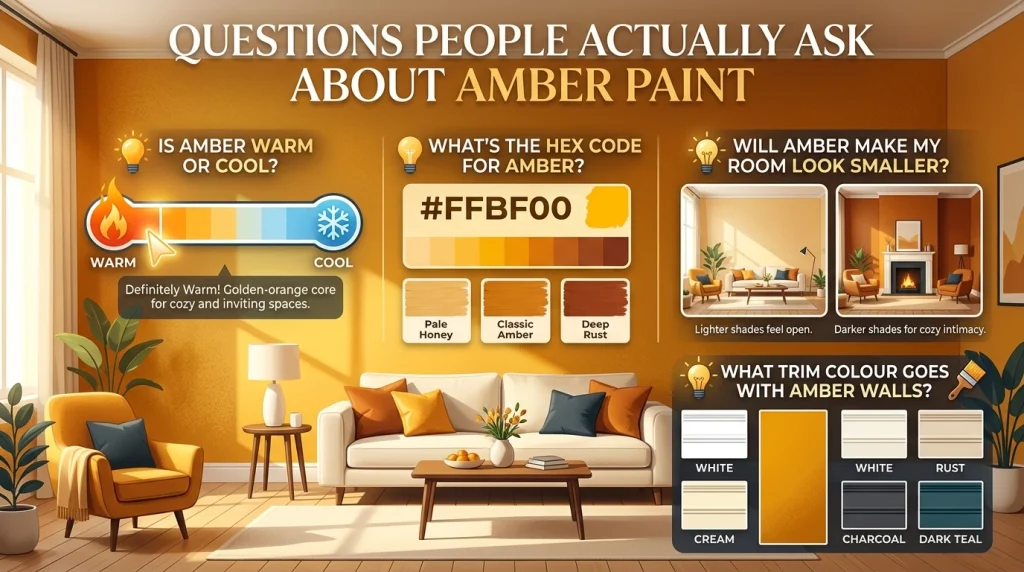
Is amber warm or cool?
Warm. Definitely warm. It’s golden-orange at its core, which makes it cozy and inviting.
What’s the hex code for amber?
#FFBF00 is the standard, but amber paint shades vary wildly. Some are pale honey. Some are deep rust.
Will Amber make my room look smaller?
Darker ambers can make a room feel more intimate. Lighter shades like Pale Amber or Amber Blush keep things feeling open.
What trim color goes with amber walls?
White or cream is classic and safe. For something bolder, try charcoal or dark teal.
My Honest Take: Only Try It
Here’s the thing about amber paint colour. You can read all the guides and stare at all the swatches and still not know until you actually paint a sample on your wall.
So do that. Get a sample pot. Paint a big square. Look at it in morning light. Look at it at night. Live with it for a few days.
I think you’ll fall in love. Amber brings something special to a space. It’s warm without being boring. Bold without being aggressive. Timeless without being stuck in the past.
Whether you go soft and subtle or rich and dramatic, amber invites you to slow down and enjoy the glow. And honestly? We could all use a little more of that.
Want more colour inspiration? Head over to Paint Palette for honest guides, real room ideas, and colours that actually work in real homes