I will be honest with you. I have painted my living room four times in the last three years. Four. My partner has officially banned me from the paint aisle at our local hardware store. But here’s the thing: every single time, I gravitated toward blue. And apparently, I am not alone.
The paint industry has spoken, and 2026 looks set to be the year blue finally has its moment in the spotlight. But not just any blue. Not just any blue, though. We are talking about blues that make you want to curl up with a book and forget your phone exists. Blues that feel like a deep breath you did not know you needed.
So if you are sitting there with fifteen paint swatches fanned out on your kitchen counter, wondering which one won’t make you regret everything in six months, this one’s for you.
Why Is Everyone Suddenly Obsessed With Blue Paint Colors?
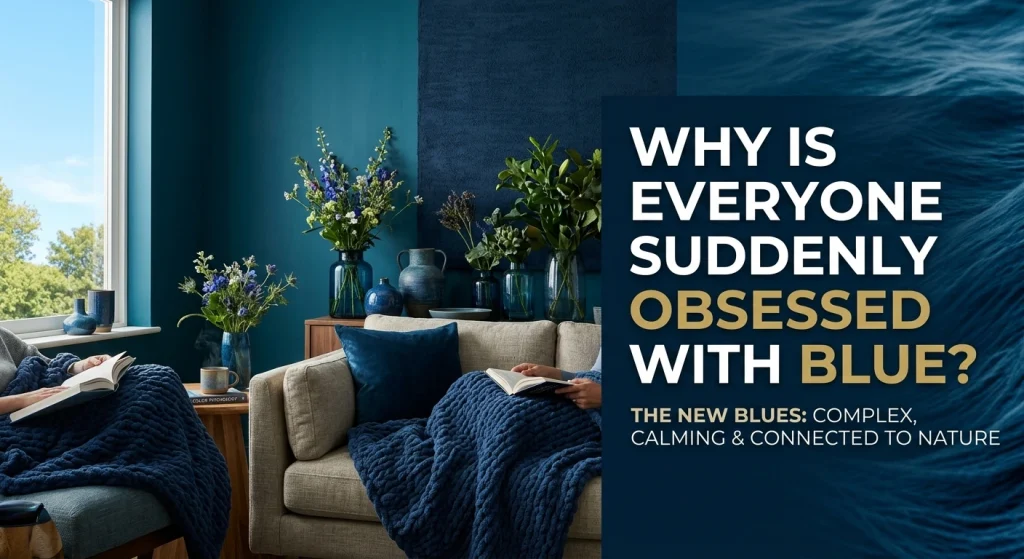
Here is my theory: we are exhausted.
After years of beige walls and gray everything (looking at you, 2019), people are craving something that actually makes them feel something. And blue real blue, not that sad gray-blue that just looks like dirty water does exactly that.
Tash Bradley, color psychologist at Lick, put it better than I ever could. She says blue is “the color of the mind.” It’s “supportive, soothing, clarifying, and has an extraordinary ability to connect us straight back to nature.”
Translation? Blue calms you down without putting you to sleep. It’s the color equivalent of a weighted blanket.
But 2026’s blues are not your grandmother’s powder blue. They are complex, layered, and honestly a little bit moody. Let me walk you through what’s actually trending.
Dulux Did Something Wild This Year
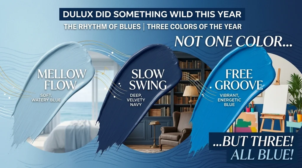
For the first time in 23 years, Dulux did not pick one Color of the Year. They picked three—all blue. The collection is called “Rhythm of Blues,” and honestly? I kind of love it.
Mellow Flow is the light one: a soft, watery blue that feels like standing at the edge of the ocean on a clear morning. It’s the shade you want in a bathroom or a bedroom where you are trying to convince your brain to slow down.
Slow Swing is my personal favorite. It’s a deep, velvety navy that makes me want to paint my entire library (okay, my one bookshelf) in it. Dulux describes it as “grounding and reassuring,” like an inky starlit sky. I’d describe it as the color of a really good burgundy wine, but blue. Make of that what you will.
Free Groove is the wildcard—a vibrant, energetic blue that feels like it’s been waiting for you to finally create something. It’s playful without being childish.
Marianne Shillingford, Creative Director at Dulux, explained the thinking behind the trio: “Blue has been the world’s favourite colour for years – but it’s far from one note. It delivers a sense of fluidity, relief, stillness and freedom, which is exactly what’s needed in today’s fast-paced world.”
She’s not wrong. We could all use a little more stillness.
Benjamin Moore’s Raindance Is the Safe Bet You Won’t Regret
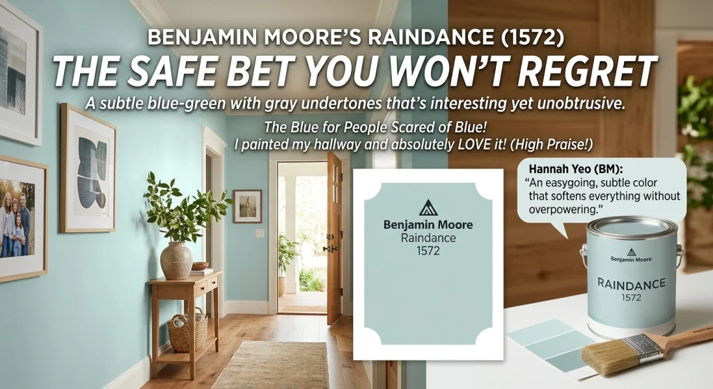
If Dulux’s blues feel a little too bold, meet Raindance. It’s a pale blue-green with a gray undertone that somehow manages to be both interesting and completely unobtrusive.
Hannah Yeo, senior color marketing manager at Benjamin Moore, calls it “easygoing.” I would call it the blue for people who are scared of blue.
“That gray undertone really softens everything,” Yeo says. “It’s a subtle color that does not overpower anything and lets all the different elements in an area come to the forefront.”
I tested Raindance on a small wall in my hallway last month. It’s the first blue I have tried that didn’t make me want to paint over it immediately. That’s high praise coming from me.
Etsy’s Patina Blue Has a Story
This one surprised me.
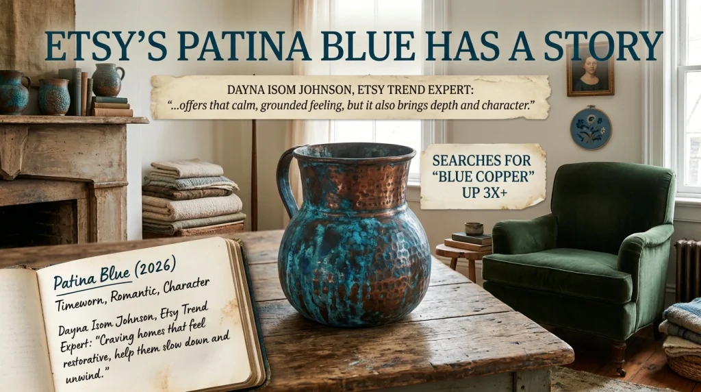
Etsy, yes, the marketplace picked a Color of the Year for 2026. It’s called Patina Blue, and it’s named after the timeworn blue tinge that aged copper develops. It’s moody, vintage, and honestly kind of romantic.
Dayna Isom Johnson, Etsy’s Trend Expert, explained the appeal: “Right now, people are craving homes that feel restorative, places that help them slow down and unwind. Patina Blue offers that calm, grounded feeling, but it also brings depth and character. It’s less about perfection and more about…”
The fact that searches for “blue copper” have increased more than threefold tells me this is not just a marketing gimmick. Real people are actually looking for this shade. And honestly? I get it. There’s something about a color that looks like it’s been around for a hundred years that feels comforting right now.
Sherwin-Williams Went Soft and Hazy
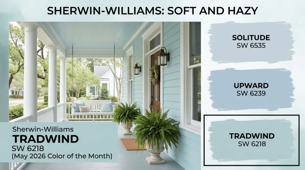
Sherwin-Williams’ 2026 Colormix Forecast includes a palette called “Frosted Tints” that’s full of these dreamy, gauzy blues that look like they have been filtered through morning fog.
Some standouts: Solitude (SW 6535), Upward (SW 6239), and Tradewind (SW 6218). Tradewind even snagged the May 2026 Color of the Month spot. It’s a tranquil blue with subtle green undertones that apparently evokes “southern charm.”
I have never been to the South, but if it looks anything like Tradewind, I am booking a flight.
Behr’s Hidden Gem Is the One Everyone’s Talking About
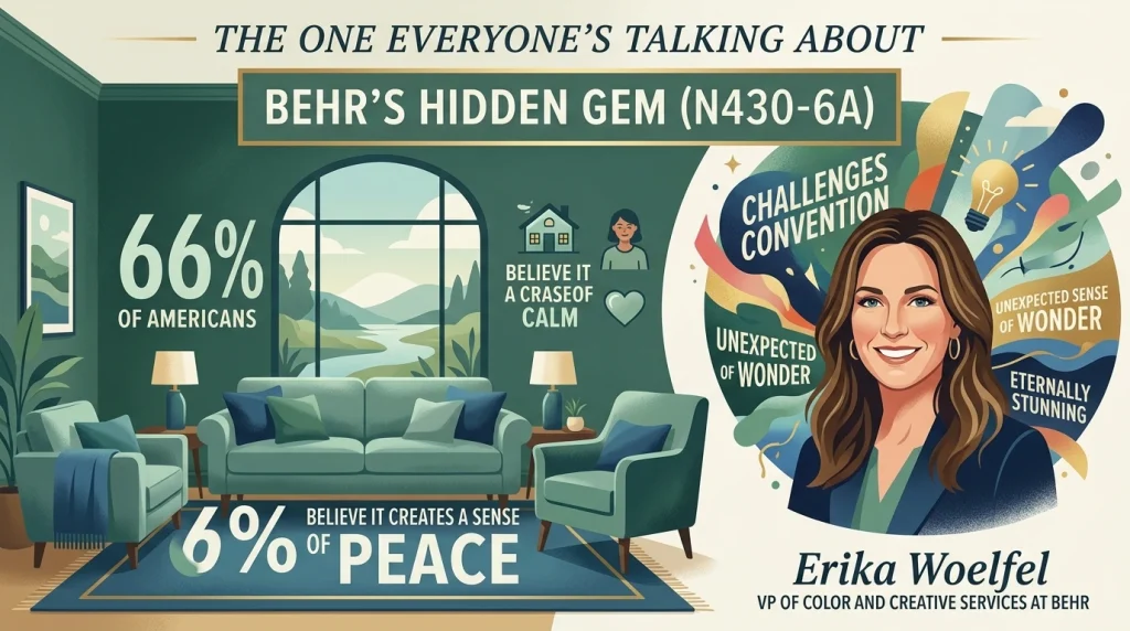
Behr went in a slightly different direction with their 2026 Color of the Year. Hidden Gem (N430-6A) is a smoky jade, a blue-green hybrid that feels both grounded and energizing.
Erika Woelfel, VP of Color and Creative Services at Behr, said: “Now more than ever, there’s a growing appetite for colors that challenge convention and bring an unexpected sense of wonder to everyday spaces. Hidden Gem captures that spirit in both name and color; its depth and refinement meet the desire for colors that are eternally stunning and stylish.”
Here’s the part that got me: Behr’s research found that 66% of Americans believe Hidden Gem would create a sense of peace in their home. Two-thirds of the country want the same paint color to feel peaceful? That says something about the moment we are in.
How to Pick the Right Blue Paint Colors Without Losing Your Mind
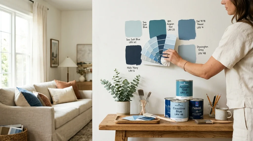
I have made every mistake in the book. Here’s what I wish someone had told me sooner.
Pay Attention to LRV (It Actually Matters)
LRV stands for Light Reflectance Value, and it’s the number that tells you how much light a color bounces back into the room. It’s the difference between a blue that feels like a breath of fresh air and one that feels like a cave.
- Under 15: These are your almost-black blues. Dramatic, moody, and perfect for accent walls or cabinetry. Just do not paint a small windowless room in them unless you are trying to create a vampire lair.
- 15 to 40: The “mid-blue” zone. Think teal, dusty blue, slate. Substantial but not heavy. These work well in full rooms with decent natural light.
- 40 to 65: Airy mid-tones. These are the crowd pleasers. Most rooms can handle these without complaint.
- Over 65: Pale washes. Gorgeous in theory, but they can read as gray on cloudy days. I learned this the hard way.
Undertones Will Make or Break You
Pure blue basically does not exist in residential paint. Every blue leans somewhere green (teal, ocean), purple (periwinkle), or gray (steel, slate).
Here’s a trick I use: hold your paint chip against a pure white piece of printer paper. The contrast will reveal which way the color leans. It sounds silly, but it works.
Your Room’s Light Direction Changes Everything
North-facing rooms make blues look colder. South-facing rooms soften them and bring out warm undertones. East-facing rooms shift throughout the day like a mood ring. West-facing rooms warm up in the afternoon.
This is why you should never, ever paint based on a tiny swatch under fluorescent store lighting. Paint a large sample at least 2×2 feet and live with it for a few days. Watch how it changes from morning to night.
Blue Paint Ideas by Room (From Someone Who’s Tried Them)
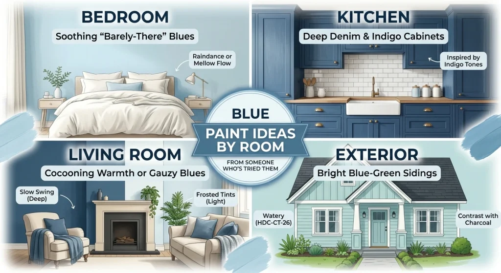
Bedroom
For bedrooms, I am a big fan of the “barely-there-blue” trend, shades so soft they are almost white but with just enough color to feel intentional. Raindance by Benjamin Moore or Mellow Flow by Dulux both fit the bill. They lower the temperature of your sleep space without making it feel clinical.
Kitchen
Kathy Hilton’s indigo kitchen cabinets have spawned a thousand copycats, and honestly? I get it. Deep denim and indigo tones are surprisingly safe. They work in contemporary and traditional kitchens alike. Pair them with off-white and cream for a classic look, or add mustard accents if you are feeling bold.
Living Room
For a statement living room, Slow Swing by Dulux is the move. It wraps the room in this cocooning warmth that makes you want to cancel your weekend plans. If you want something lighter, Sherwin-Williams’ Frosted Tints palette has these gauzy blues that create a sense of hush.
Exterior
Behr’s Watery (HDC-CT-26) is a pale blue-green that brightens exteriors without making your house look like a beach rental. Pair it with charcoal or slate blue for clean contrast.
A Few Things I Have Learned the Hard Way
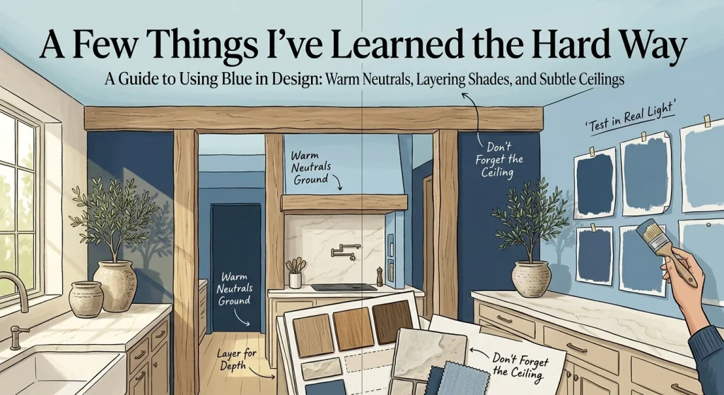
Warm neutrals are your best friend. Wood tones, creamy whites, and natural stone ground blue’s coolness and keep it from feeling sterile.
Layer your blues. The 2026 approach is all about depth. Combine a deep navy accent wall with lighter blue trim. Use blue cabinetry against a pale blue backsplash. Mixing shades makes the space feel intentional.
Don’t forget the ceiling. A pale blue ceiling creates the sensation of open sky. It’s subtle, but it works.
Test with real light. I mentioned this already, but it bears repeating. Paint large samples. Live with them. Do not trust the tiny swatch.
Questions I Get Asked All the Time
What’s the most popular blue paint color for 2026?
Dulux’s Rhythm of Blues collection (Mellow Flow, Slow Swing, and Free Groove) is probably the most prominent. Benjamin Moore’s Raindance and Behr’s Hidden Gem are also defining shades this year.
Are blue paint colors still in style for 2026?
Short answer: yes. Long answer: blue is arguably the color trend for 2026. Major paint brands, Etsy, and Pinterest are all highlighting blue shades in their forecasts.
What blue makes a room feel calm?
Lighter, softer blues with gray or green undertones tend to feel most calming. Raindance by Benjamin Moore and Mellow Flow by Dulux are both excellent choices.
What’s the best blue paint colors for cabinets?
Deep, saturated navies and indigos. Hale Navy by Benjamin Moore and Naval by Sherwin-Williams are designer favorites that read unambiguously navy, with no surprise purple or green flashing.
How do I choose between warm and cool blues?
Consider your room’s natural light. For north-facing rooms, warmer blues with green or grey undertones are a good choice. South-facing rooms can take cooler, more saturated blues.
So what’s the verdict?
2026’s blue paint colours are more than just trendy. They are a response to how we want to feel in our homes. Calm. Grounded. Connected to something bigger than our to-do lists.
Whether you are drawn to the quiet clarity of Mellow Flow, the vintage depth of Patina Blue, or the bold confidence of Hidden Gem, there’s a blue out there for you. You just have to be willing to test it, live with it, and maybe repaint once or twice.
Trust me. I have done it four times. It’s worth it.
Ready to start your blue paint project? Explore our curated collection of blue paint swatches and color tools at PaintPallete.com to find your perfect shade.