
The first room I ever painted white was a disaster.
I picked a chip called Simply White because the name sounded friendly. It went on the wall and turned the whole room the color of a lemon that had been sitting in the fridge too long. My landlord noticed. My neighbor noticed. The guy delivering a mattress noticed. I repainted it three weeks later with something cooler and spent $180 learning a lesson I could have learned for free.
So here’s what I’d tell anyone standing in the paint aisle right now, staring at 150 chips that all say white paint: they are not the same shades of white paint. Not even close. The difference is invisible on a fan deck and blindingly obvious once it’s on a wall.
Every White Paint Has a Secret Pigment

There’s no such thing as a pure white paint. Every shade carries a small amount of another pigment that pushes it in one direction, and that tiny push is what you actually see on your walls. Paint manufacturers call it undertone. I call it the thing that ruins your weekend.
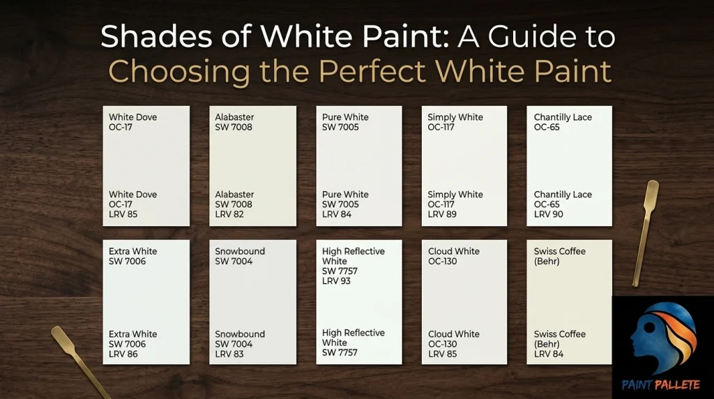
Warm whites lean yellow, cream or beige. They feel cozy and forgiving. Benjamin Moore White Dove and Sherwin-Williams Alabaster live here.
Cool whites carry blue, gray, or green. They read crisp and modern, sometimes cold. Chantilly Lace and Extra White are the usual suspects.
Neutral whites keep their undertones so faint that they barely register. Sherwin-Williams High Reflective White is the extreme version, with an LRV of 93 and almost no color at all.
LRV: The Number That Actually Matters
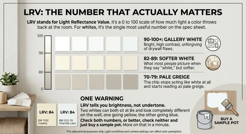
LRV stands for Light Reflectance Value. It’s a 0 to 100 scale of how much light a color throws back at the room. For whites, it’s the single most useful number on the spec sheet.
Above 90 is gallery white. Bright, high contrast, unforgiving of drywall flaws. Between 82 and 89 you get what most people picture when they say “white,” but softer. Below 80, the chip stops acting like white at all and starts reading as pale greige.
One warning. LRV tells you brightness, not undertone. Two whites can both sit at 84 and look completely different on the wall, one going yellow, the other going blue. Check both numbers, or better, check neither and just buy a sample pot. More on that in a minute.
How Light Wrecks Your Color Choice
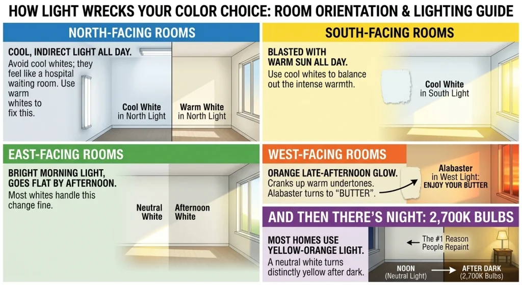
Room orientation matters more than most people want to believe.
North-facing rooms get cool, indirect light all day. Warm whites fix this. Without them, the room feels like a waiting room in a hospital.
South-facing rooms get blasted with warm sun. Cool whites balance it out.
East-facing rooms get bright morning light and go flat by afternoon, which most whites handle fine.
West-facing rooms get that orange late-afternoon glow that cranks up warm undertones until your white looks like butter. If you’re painting a west-facing living room and you picked Alabaster, enjoy your butter.
And then there’s night. Most homes have 2,700K bulbs, which throw yellow-orange light. A white that looks perfectly neutral at noon turns distinctly yellow after dark. This is the single most common reason people repaint.
Ten White Paints Worth Knowing

These are the ones that come up again and again in real projects, not just on mood boards.
White Dove (OC-17), LRV 85. Warm, soft, slightly gray. The safest whole-house white there is. If you can’t decide, pick this one and move on with your life.
Alabaster (SW 7008), LRV 82. Cozier than White Dove, warmer, a little green in the mix. Wonderful in bedrooms.
Pure White (SW 7005), LRV 84. Honestly a bit overrated. It’s fine. It’s balanced. It’s also the default answer everyone gives, and defaults aren’t always right.
Simply White (OC-117), LRV 89. Bright and warm. Great in rooms that need sunshine. Not great in my old apartment, as established.
Chantilly Lace (OC-65), LRV 90. Crisp, modern, nearly neutral. Designers love it. I think it can look clinical in small rooms, but on cabinets it’s hard to beat.
Extra White (SW 7006), LRV 86. Cool and clean. Excellent trim color.
Snowbound (SW 7004), LRV 83. Cool with a soft gray edge. Sophisticated without being icy.
High Reflective White (SW 7757), LRV 93. The brightest white Sherwin-Williams sells. Art galleries use it because it makes everything else pop. Also shows every crack in your drywall.
Cloud White (OC-130), LRV 85. Soft and creamy. The go-to for millwork.
Swiss Coffee (Behr), LRV 84. Warm, creamy, endlessly versatile. Bridges warm and cool elements in a room better than almost anything else.
Where Black Paint Comes In

Here’s the part nobody mentions. White walls need something to push against, or they just read as flat. Black paint is the fastest way to give white paint a job.
Black interior doors on white walls. Black window frames. A black fireplace surround. Black baseboards, if you’re brave. The contrast makes the white look intentional instead of unfinished, and it’s a much cheaper way to add drama than replacing furniture.
The trick with paint on white is restraint. One black element per room. Two, if the room is large. Beyond that you are not designing a space, you are staging a chessboard.
Test It or Regret It
Buy sample pots. Paint swatches on at least two walls, not one. Leave them up for two full days and look at them in morning light, afternoon light and after dark.
Also: white paint on a wall and white paint on a ceiling are different decisions. A ceiling one shade lighter lifts the room. Same white everywhere gives you a seamless, modern box. Both work. Just decide on purpose.
What I Would Actually Do
Pick two whites you like. Sample both. Live with them for 48 hours. Then pick the one that looks right at 7pm, because that’s when you’ll actually be home looking at it.
Warm whites for cozy rooms. Cool whites for modern ones. Neutral whites when you can’t commit. And if you are painting the whole house, keep the same white on every wall and change the trim color instead. It saves money and it never looks wrong.
At PaintPallete, we have got every shade in this guide and about 140 more, plus the blacks to go with them. Come find the one that works in your light.