Last month, I stared at a fresh 16×20 canvas for forty-five minutes. Didn’t touch a brush. Just stared.
You know the feeling. That blinding white surface practically dares you to mess it up. And when you finally do start paint on white, something weird happens. Your colors look flat. Your shadows turn muddy. That lovely cerulean blue you blended on your palette now looks different.
Here’s what took me years to figure out: the white canvas is the problem. Not you.
Professional painters figured this out centuries ago. Rembrandt, Titian, and Velázquez none of them started on raw white. They knew something most beginners don’t: painting on a white canvas actually makes your job harder.
Let me show you why and what to do instead.
Why Paint on White Canvas? Sabotages Your Work
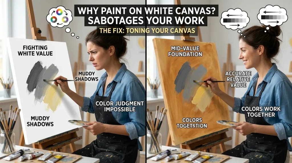
A white canvas isn’t a neutral starting point. It’s the brightest value you’ll ever have on that surface. Every color you place on it is judged against pure white.
That means your eye can’t settle. A mid-tone gray looks almost black against white. A soft yellow practically disappears. You’re making value decisions without any reference point in the middle.
And here’s the kicker: it only gets worse as you fill in more of the canvas. Shadows start looking muddy. Highlights feel flat. The whole painting doesn’t hold together the way you imagined it.
I used to think I was just bad at color mixing. Turns out I was fighting an impossible battle.
The Fix: Toning Your Canvas Before You Paint
Toning is exactly what it sounds like. You cover the white ground with a thin layer of color before you start your actual painting. Simple concept. Massive difference.
Why does it work? Because toning gives you a mid-value starting point. Suddenly you are not jumping from extreme white to extreme dark. You’re working from the middle outward. Your eye can actually judge relative values.
Acrylic painters love this approach because the paint dries fast. You can tone a canvas in ten minutes and start painting the same afternoon. Oil painters have been doing this for centuries with slightly different materials.
Three Approaches That Actually Work

Imprimatura (The Classic Method)
This is what the Old Masters used. You mix a thin wash of raw umber or burnt sienna with solvent, apply it loosely across the whole canvas, then wipe back the light areas with a rag.
You will get a transparent stain. The white primer still reflects light through the paint. It dries fast, usually within an hour with solvent-thinned oil paint.
I use this method for portraits. The warm earth tone naturally reads as a mid-value shadow, and skin tones sit beautifully on top of it. You’re working with the ground instead of fighting it.
Opaque-Toned Ground (Beginner-Friendly)
If imprimatura feels risky, go opaque. Mix a flat mid-tone neutral gray, muted earth, or whatever suits your subject—and apply it like a thin coat of house paint. No light passes through. What you see is what you get.
This is the most forgiving approach. There are no surprises when you build layers on top. The value you set at the beginning stays consistent underneath everything else.
Liquid White (For Wet-Into-Wet Painting)
If you paint alla prima, wet paint into wet paint, try a liquid white base. It’s a thin coating of titanium white mixed with linseed oil and solvent that you brush across the canvas before starting.
The paint on top blends easily because of that wet layer underneath. Colors mix directly on the canvas and dry slowly.
My recipe: one part titanium white oil paint, one part linseed oil, and one part odorless mineral spirits. Stir it up and brush it on thin.
Choosing the Right Tone for Your Painting
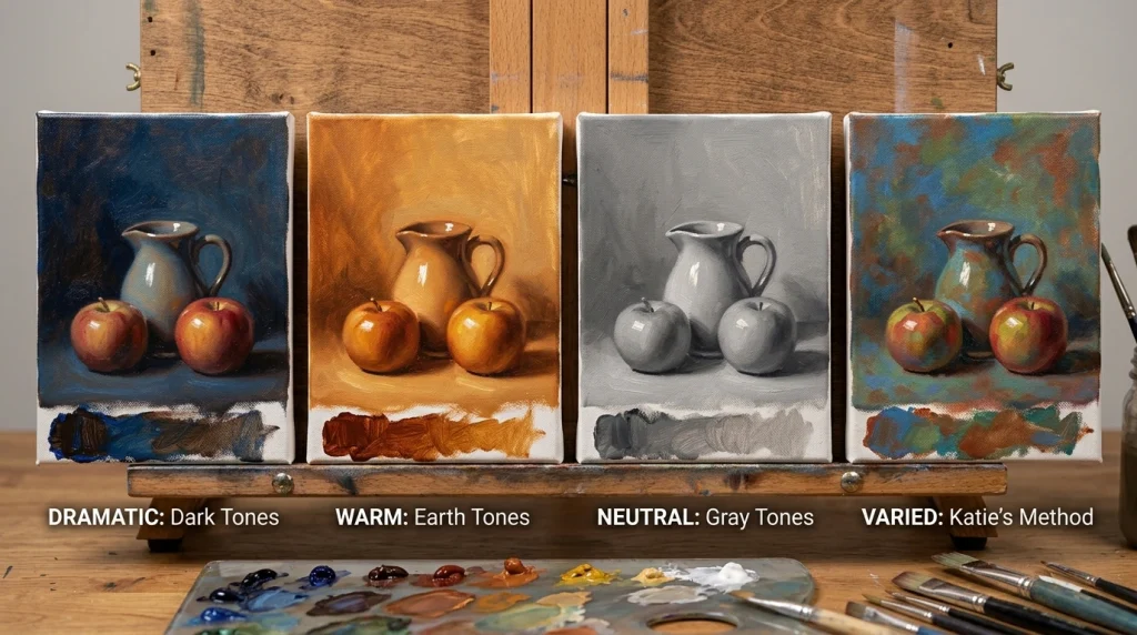
The tone you choose sets the emotional temperature of everything that follows.
Want drama and atmosphere? Go dark. A deep brown-blue mixture creates instant mood before you’ve painted a single real stroke.
Warm and natural? Burnt sienna or raw umber. These earth tones are the workhorses of tonal grounds. They create warmth under skin tones and landscapes and make cool highlights pop.
Something neutral and controllable? Neutral gray. No color bias. Perfect for product studies or portraits where you need accurate value judgments above all else.
Here’s the thing: there’s no wrong answer. Katie Liddiard, an artist I follow on Artists Academy, varies her tone across the entire canvas. Some areas are more brown, others more blue or green. That variation adds depth if any of the ground shows through in the final piece.
Steal that idea. Your underpainting doesn’t have to be uniform.
Common Mistakes When You Paint on White Canvas
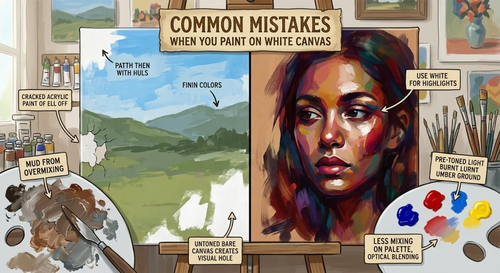
- Going straight to the white surface: This is the big one. Without a toned ground, your colors look patchy and flat. Your whites have nowhere to go; they’re already there.
- Using standard white acrylic paint as a primer: Gesso is formulated to absorb paint properly. White paint isn’t. Your finished piece might peel or crack.
- Overmixing on the palette. When you mix complementary colors, you will get mud. Keep them separate on the canvas. Let your eye do the blending from a few feet away.
- Leaving large areas of white canvas bare. A small sliver of white can work beautifully inside an outline. But big blank areas create a visual hole in your painting. Some artists worry it might even make the surface more prone to cracking over time.
Your First Step
Grab a canvas. Any canvas. Mix a small amount of raw umber or burnt sienna with water or medium until it’s thin like skim milk. Brush it across the surface. Wipe back the areas where you want light to come through. Let it dry.
Then paint.
You’ll notice the difference immediately. Colors sit better. Values make sense. You stop fighting the canvas and start working with it.
The white canvas isn’t your enemy. It’s just not ready yet. Tone it down, and suddenly everything clicks.
For more informational blogs about paint combinations visit Paint Pallete