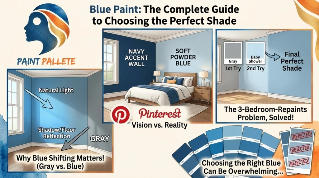
So You Want to Paint Something Blue. Let me guess. You saw a photo on Pinterest. Maybe it was a navy accent wall or a soft powder blue bedroom. You saved it. You stared at it. And now you are standing in a paint store, completely overwhelmed by a wall of blue chips that all look… the same?
Yeah. I have been there. Actually, I painted my bedroom three times in one month trying to find the right blue. My partner thought I would lost it. The first shade looked gray. The second looked like a baby shower. The third? Finally got it right.
Here’s what I learned the hard way: blue paint does not play by the same rules as other colors. It shifts. It morphs. It has a personality that changes depending on where the sun is and what’s sitting on your floor.
This guide is everything I wish someone had told me before I wasted three weekends and way too much money on paint samples.
Why Blue Paint Keeps Winning

Blue is not just trendy. It’s timeless. And in 2026, it’s having a serious moment. Dulux picked a trio of blues as their Colors of the Year. Etsy named “patina blue” its color of the year. Farrow & Ball says blue is one of their most requested shades.
But why?
Because blue does something no other color can: it calms you down without putting you to sleep. It feels fresh without being cold. It can be coastal, elegant, moody or playful, all depending on which blue you choose.
The problem? That versatility is also what makes it so easy to get wrong.
The Real Reason Your Blue Paint Looks Off
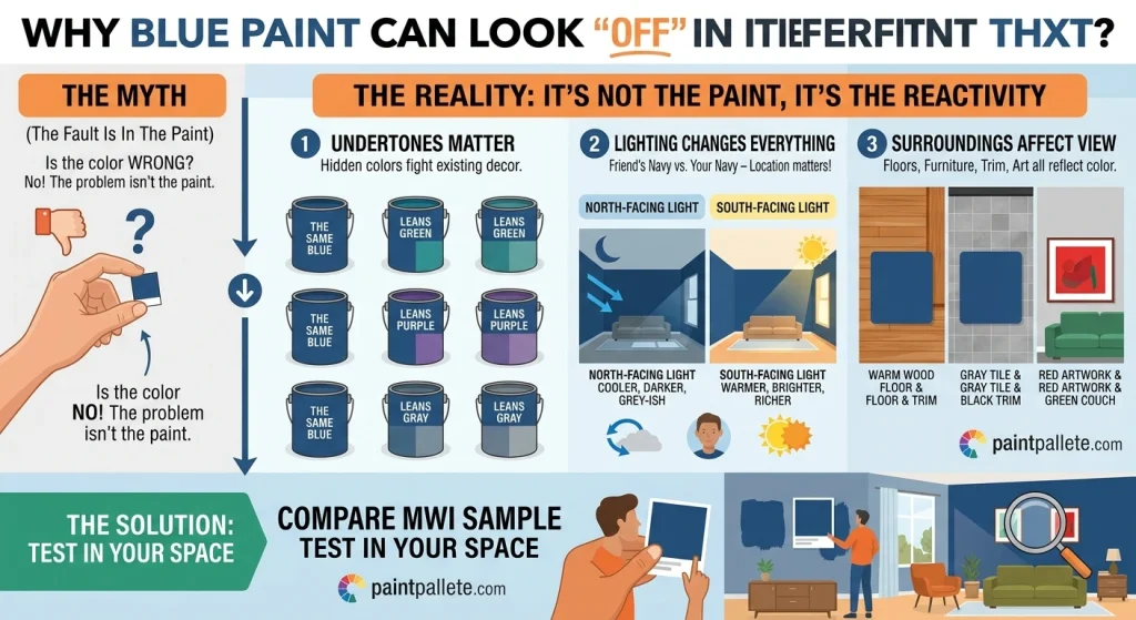
Most people blame the paint. The paint is not the problem. The problem is everything around it.
Designers call blue a reactive color. It responds to:
Undertones. Every blue has a hidden color lurking underneath. Some lean green. Some lean purple. Some lean gray. Pick a blue with the wrong undertone, and it will fight everything in your room.
Lighting. A north-facing room makes blue look cooler and darker. A south-facing room warms it up. This is why your friend’s navy wall looks nothing like yours even though you bought the same can.
Your stuff. Floors. Trim. Furniture. Even the art on your walls. All of it affects how blue reads in a space.
Here’s the uncomfortable truth: you cannot pick blue paint from a tiny chip under fluorescent store lights. You just cannot.
How to Actually Choose the Right Blue Paint
Start With a Feeling, Not a Color
Before you look at chips, ask yourself one question: what do I want this room to feel like?
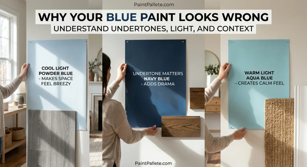
Light and breezy? Go with powder blue, sky blue or baby blue. These bounce light around and make small rooms feel bigger.
Calm and coastal? Aqua, seafoam and denim are your friends. They pair beautifully with white trim and natural wood.
Bold and dramatic? Navy, indigo and midnight blue. Use them on accent walls or in dining rooms where you want that intimate, moody vibe.
Modern and moody? Slate blue, steel blue or graphite. These feel contemporary and grounded. Great for kitchens and home offices.
Check Undertones Against Your Fixed Elements
Grab paint chips and hold them against your floors, countertops and any furniture that’s staying. You are not looking for a match. You are looking for harmony.
If your floors are warm-toned (think oak or walnut), a warm blue will feel more cohesive. If your floors are cool gray, a cool blue will sing.
Test Like You Mean It
Paint large swatches on foam board. Move them around the room. Check them in morning light, afternoon light or at night with your lamps on. Live with them for two or three days.
I know. It’s annoying. But it’s way less annoying than repainting an entire room.
Blue Paint Colors Designers Keep Coming Back To

Benjamin Moore Hale Navy (HC-154). The navy. Rich, deep and classic. It works on cabinets, accent walls and even front doors.
Sherwin-Williams Sea Salt (SW 6204). A soft blue-green that feels like a spa day for your walls. Bathrooms and bedrooms love this one.
Benjamin Moore Palladian Blue (HC-144). Dreamy blue-green with gray undertones. Calm, elegant and weirdly easy to live with.
Sherwin-Williams Rainwashed (SW 6211). Tranquil coastal blue. Perfect for living rooms and open-concept spaces.
Benjamin Moore Van Deusen Blue (HC-156). Muted blue-gray that reads almost neutral. Great for bedrooms and dining rooms.
Sherwin-Williams Naval (SW 6244). Bold, saturated navy. Makes a statement without feeling heavy.
Blue Paint by Room: What Actually Works

Bedroom. Soft blues paints are your best bet. Powder blue, dusty blue-gray, pale blues with warm undertones. Navy as a single accent wall behind the bed adds depth without swallowing the room.
Bathroom. Spa blues, aqua, seafoam. Pair with white tile and warm lighting so it does not feel clinical.
Kitchen. Blue cabinets are timeless. Gray-blue and navy work especially well with brass hardware and wood counters.
Living room. Slate blue and muted navy feel sophisticated. Lighter blues keep things open and friendly.
Kids’ room. Bright blue adds energy. Balance it with white furniture and colorful textiles so it does not feel chaotic.
What Colors Go With Blue Paint?
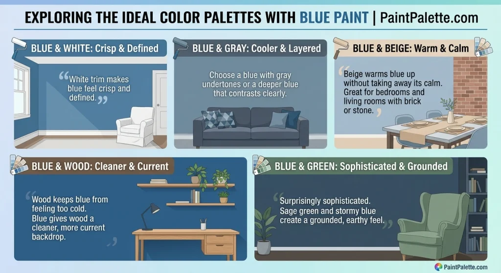
Blue and white. The most reliable pairing. White trim makes blue feel crisp and defined.
Blue and gray. Cooler and more layered. Choose a blue with gray undertones or a deeper blue that contrasts clearly.
Blue and beige. Beige warms blue up without taking away its calm. Great for bedrooms and living rooms with brick or stone.
Blue and wood. Wood keeps blue from feeling too cold. Blue gives wood a cleaner, more current backdrop.
Blue and green. Surprisingly sophisticated. Sage green and stormy blue create a grounded, earthy feel.
Mistakes I Made So You Don’t Have To

“My blue looks too cold.” Add warm whites, wood tones, or brass accents. You should choose blue paint with a warmer tone
“It looked navy in the store but baby blue on my wall.” Lighting and undertone. Navy can look brighter in sunny rooms. Always test a large sample.
“It clashes with my furniture.” Match undertones. Cool blues go with cool grays. Warm blues go with beige, cream and wood.
“It looks different at night.” Blue paint colors are most reactive to artificial light. Warm bulbs make blue cozier. Cool bulbs make it icier. Test with the bulbs you actually use.
Frequently Asked Questions About Blue Paint
What’s the most popular blue paint color for 2026?
Navy, slate blue, and soft powder blue are still dominating. Dulux’s 2026 picks lean toward cool, calming blues with gray undertones.
Does blue paint make a room look smaller?
Light blues can make rooms feel larger by reflecting light. Dark blues make rooms feel cozier and more enclosed. Sometimes that’s exactly what you want.
Is blue paint good for bedrooms?
Yes. Soft and muted blues are especially calming. They promote rest.
What white trim goes with blue paint?
Warm whites for warm blues. Crisp whites for cool blues. When in doubt, test both against your blue swatch.
How many coats of blue paint do I need?
Usually two. Deep navy and saturated blues might need three for even coverage.
Final Thoughts
Blue paint isn’t just a color. It’s a mood. A feeling. A decision that can completely change how a room works for the people living in it.
Understand the undertones. Test in your actual lighting. Choose a blue paint color that solves your room’s problems instead of creating new ones.
And if you mess up the first time? Hey. I painted my bedroom three times. You are in good company.
Ready to find your perfect shade? Explore paintpallete.com for curated blue paint colors and designer inspiration.