
I painted a turquoise bathroom in 2021 and hated it for about six months.
Not the color’s fault, really. I picked a shade off a chip, didn’t think that the room had one tiny north-facing window and zero natural light, and ended up with something that looked less like the Aegean and more like a 1980s dentist’s office. I repainted it in a weekend and learned a lot.
So this guide is the one I wish I’d had. The best turquoise paint colors for 2027, sorted by where they actually work, plus the undertone stuff that separates a good turquoise from a cheap-looking one.
Why turquoise paint is everywhere right now
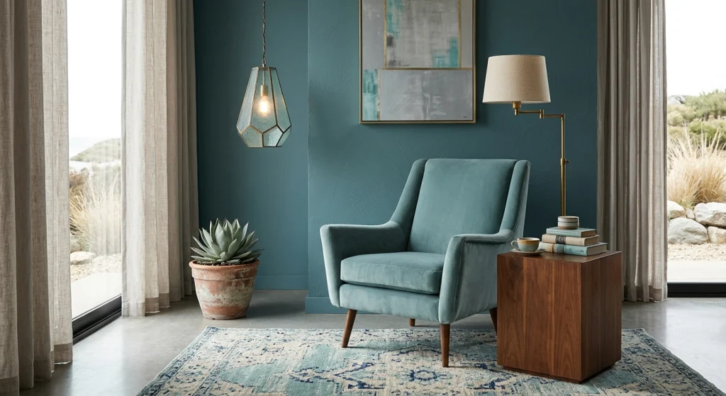
Turquoise Paint has a reputation problem. People hear the word and picture cheap coastal decor, seashell bathroom sets, souvenir shop tchotchkes. That’s a shame, because turquoise done right is one of the most useful colors in the entire spectrum.
It’s a blue-green, which means it sits between two families that both read calm. It works with warm wood, cool stone, brass, black, and white. It’s saturated enough to be a moment without being loud. And unlike a lot of trendy colors, it doesn’t demand you redecorate the entire house around it.
In 2027, the turquoise paint colors getting attention aren’t the bright, postcard kind. It’s muted, dusty, and slightly grayed out. Teal leaning. Sea-glass leaning. The kind that looks like it’s been sitting in the sun for a while.
The undertone question that decides everything
Here’s the thing nobody tells you about turquoise paint.
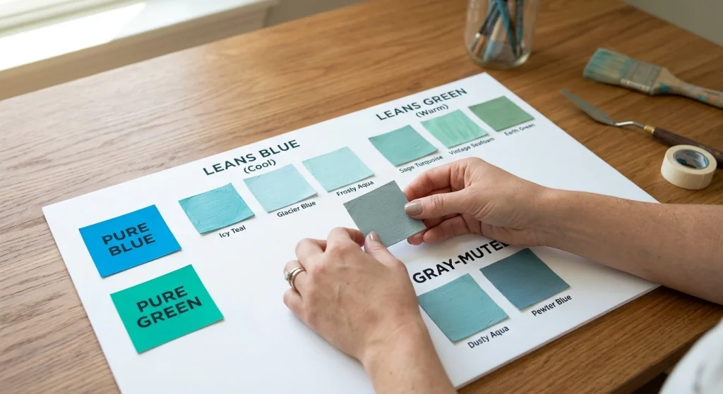
Every turquoise sits somewhere between blue and green, and that balance is the whole ballgame. Lean blue and you get cool, sharp, slightly icy. Lean green and you get warm, earthy, slightly retro. Both are legitimate. They are not interchangeable.
Then there’s the second layer: the graying. Most good turquoise paint has some gray mixed in. That’s what keeps it from screaming. Too little gray and the color looks juvenile. Too much and it dies into a sad, flat gray-blue.
My advice: before you buy anything, hold your sample next to a pure blue and a pure green. You’ll instantly see which way it leans. Then check it against your flooring and any wood in the room. If your floors are warm oak and your turquoise is icy cool, you are going to mess with your hands.
Best turquoise paint colors, by how you’ll actually use them
For bathrooms and powder rooms
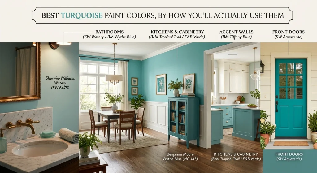
Sherwin-Williams Watery (SW 6478) is the one I keep coming back to. Soft, slightly grayed, reads almost like sea glass in low light. It’s forgiving in small rooms, which is more than most turquoises can say.
Benjamin Moore Wythe Blue (HC-143) is the classic answer here. It’s technically more teal than turquoise, but it’s the shade that made the whole color family respectable in interior design. Looks expensive. Ages well.
If you want a paint with more punch in a powder room, where you can afford to be bold because nobody spends more than two minutes in there, Sherwin-Williams Tantalizing Teal (SW 6937) is worth a look.
For kitchens and cabinetry
This is where turquoise paint earns its keep. Lower cabinets in a muted turquoise with warm white uppers and brass hardware are one of the best looks in kitchens right now, and it’s not going anywhere.
Behr Tropical Trail (MQ6-37) is a solid budget pick. Behance-level color at half the price. Test it on a cabinet door, not a wall; sheen changes everything.
For a more saturated, confident green-leaning turquoise, Farrow & Ball Vardo (No. 288) is stunning. It’s also expensive and has a learning curve. Worth it if you’re doing a statement island.
For front doors
A turquoise front door is the cheapest way to make a house look interesting. You’re using maybe a quart of paint. The payoff is enormous.
For this, go more saturated than you would indoors. Sherwin-Williams Aquaverde (SW 9056) or a true teal reads bold from the street without looking like a beach rental. Pair it with a warm white or cream body color, never stark white.
One warning: front doors face one direction, so you’re locked into whatever light that side of the house gets. Test it there, not in your kitchen.
For accent walls
Honestly? Skip accent walls in most cases. They date fast, and they’re hard to undo.
The exception is a room where the turquoise is doing structural work: a dining room you want to feel like a jewel box, an office where you want focus. In those cases, Benjamin Moore Tiffany Blue (2041-60) goes on a full wall with the best view. It’s brighter than the others on this list, so it needs a room with real light and a lot of white trim to balance it.
What to pair with turquoise paint
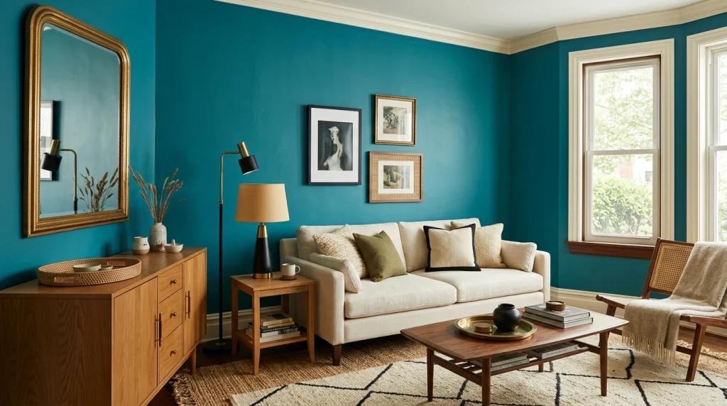
The pairings matter as much as the color.
Warm white, not cool white. Turquoise against stark white trim looks clinical. Cream, off-white, or a warm white trim softens it and makes it feel intentional.
Natural wood. Rattan, oak, walnut, cane. Turquoise plus wood is basically a cheat code.
Brass or unlacquered bronze. Not chrome. Chrome makes turquoise feel like a 1990s hotel. Brass makes it feel considered.
Black accents. Frames, hardware, light fixtures. A little black grounds the whole thing.
Skip the navy and the orange. Both compete. Both make turquoise look muddier than it is.
Mistakes I’ve made, and you can skip
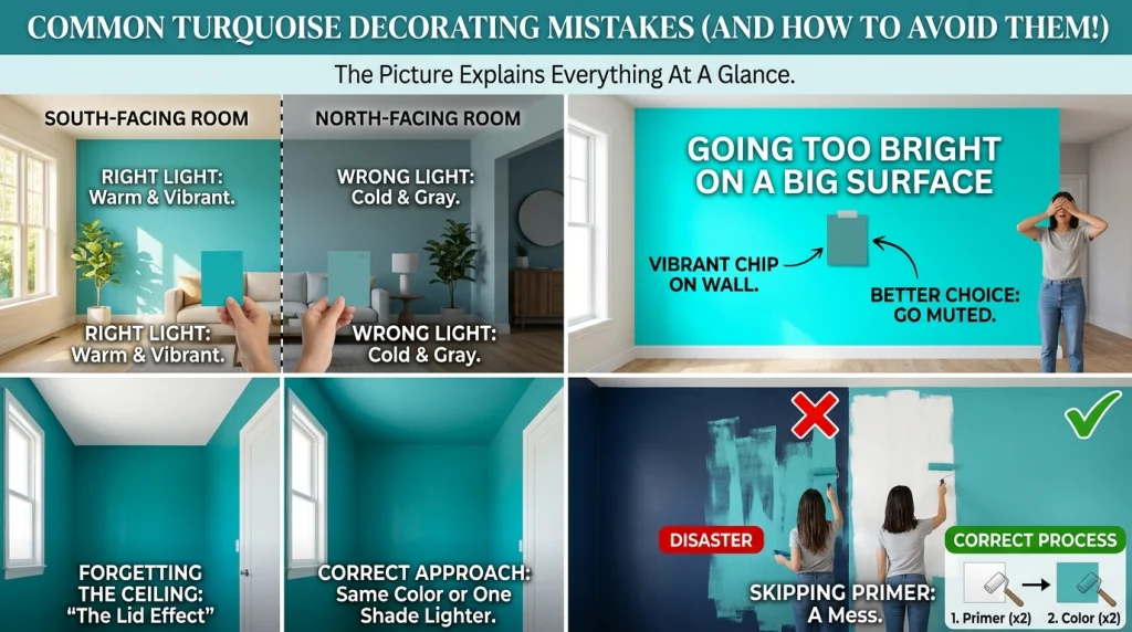
Testing in the wrong light. Turquoise is more light-sensitive than almost any other color family. A shade that’s gorgeous in a bright south-facing room will go gray and cold in a north-facing one. Test in the actual room, at the actual time of day you’ll use it.
Going too bright on a big surface. The color that looks amazing on a 4-inch chip becomes overwhelming on a full wall. If you’re torn between two shades, go with the more muted one on the first try. You can always go bolder later. Going back is harder.
Forgetting the ceiling. In a small turquoise room, a white ceiling can look like a lid. Consider painting the ceiling the same color in a flat finish, or going one shade lighter. It makes the room feel taller and more cohesive.
Skipping primer over dark colors. Turquoise over a dark wall without primer is a disaster. Two coats of primer, then two coats of color. No shortcuts.
Quick FAQ
Is turquoise paint still in style in 2027?
The muted, grayed versions, yes. The bright, saturated versions are more of a moment than a trend. Pick a dusty turquoise if longevity matters for you.
What’s the difference between turquoise and teal?
Turquoise leans blue-green and is usually lighter and brighter. Teal leans green-blue and is darker and more muted. The line between them is blurry and honestly, nobody agrees.
Does turquoise make a room look smaller?
A dark turquoise can. A light, grayed turquoise with plenty of white trim makes small rooms feel bigger, because it reads as a soft neutral from a distance.
What finish should I use?
Eggshell or satin for walls. Semi-gloss or satin for cabinets and trim. Flat only on ceilings.
Last thing
Turquoise paint color is not a risk if you pick it carefully. It’s a risk if you pick it off a chip in a store under fluorescent lights and hope for the best.
Get samples. Test them in the actual room. Look at them in the morning and at night. Check the undertone against your floors. Do that, and you’ll end up with a color you keep for a decade.
Ready to find your shade? Browse our turquoise paint color collection and get samples on the wall this week.