
I have a confession. Three years ago, I told a client that blue was “safe.” She looked at me like I’d just recommended beige. She was right, and I was wrong. Blue isn’t safe. Blue is the color that makes people exhale the second they walk through the door.
And 2027? It’s a blue year. Not a shade here and there, a full takeover. Valspar, Glidden, Pittsburgh Paints, California Paints, and Clark+Kensington all landed on blue-family colors for their Color of the Year picks. Five major brands, same conclusion. I can’t remember the last time that happened.
So yeah. Let’s talk blue.
First, the Stuff Nobody Tells You About Blue Paint
Skip this section, and you’ll be repainting by March. I’ve watched it happen.
LRV: the number that ruins dreams
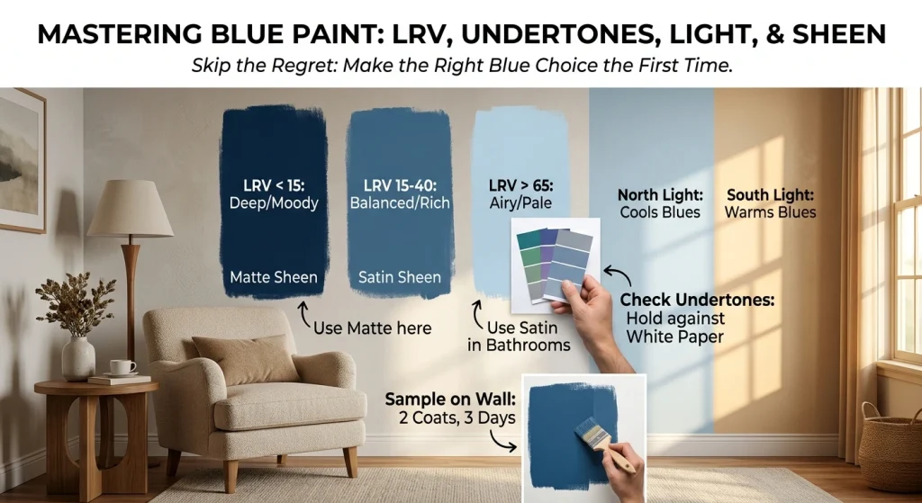
LRV is just how much light a color bounces back, on a 0-to-100 scale. Black is 0. Pure white is 100. Sounds boring. It isn’t.
Here’s the thing: a blue with an LRV under 15 looks almost black in a dim hallway. Gorgeous in photos. Gloomy in person. Mid-blues (15–40) are the sweet spot: substantial, but they don’t swallow the room. Above 65, you’re in pale-wash territory. Great for ceilings. Not great for hiding anything.
Undertones (the plot twist)
Nobody sells “pure blue.” Not really. Every blue leans somewhere green, purple, or gray. Hold the chip against plain white printer paper, and that lean shows up instantly. This is why the blue that looks perfect in your friend’s kitchen looks sickly in yours at Different.
Light direction, aka your room’s personality
North-facing rooms receive cool, even light. It makes blues colder than they look on the chip. South-facing rooms receive warm sun that softens them up. East rooms change mood all day long. West rooms go golden in the late afternoon.
Sheen matters more than you think.
Almost forgot this one, and it’s a rookie mistake I still see regularly. Flat and matte finishes absorb light and soften a blue because they make mid-tones look richer and hide wall imperfections. The eggshell and satin bounce light back, which brightens a blue but also highlights every bump and patch. For deep navies, matte is almost always the better call. For kitchens and bathrooms where you need to wipe things down, satin is the practical choice, knowing you’re trading some depth for durability.
Please. Sample it. On the actual wall. Two coats. Live with it for three days. I know it’s annoying. Paint is expensive.
Room by Room: Where Blue Actually Works
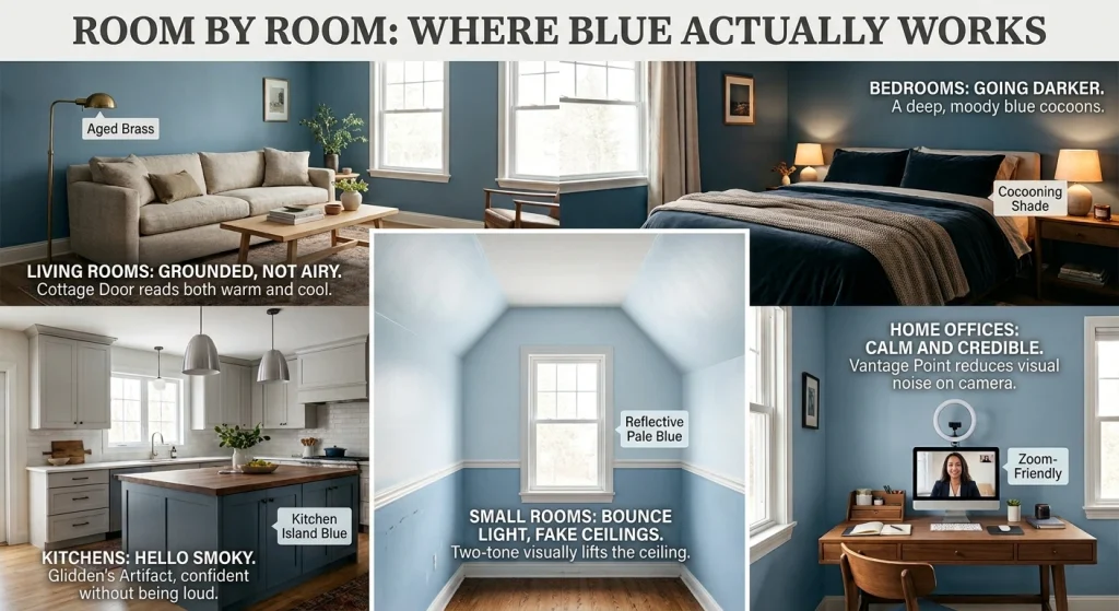
Living rooms: grounded, not airy
2027’s blues are calmer and more grounded than the icy stuff we saw earlier this decade. Valspar’s Cottage Door is the one everyone’s talking about: a mid-tone that somehow reads both warm and cool. It’s the kind of blue that hangs out quietly while your furniture does the talking. Light wood, linen, and aged brass. That’s the whole recipe.
Want more presence? Dutch Tile Blue or Quietude from Sherwin-Williams bridges warm and cool tones without screaming.
Bedrooms: the case for going darker
Hot take: most people go too light in bedrooms. Soft chalky blues are lovely, sure. But a deep, moody blue does something a pale blue can’t: it cocoons. California Paints’ Quiet Peace is basically a weighted blanket in paint form.
Your brain already reads blue as cool and calm. Water. Sky. Shade. Lean into it.
Kitchens: goodbye icy, hello smoky
Icy blues had a run. They’re done.
What’s replacing them is warmer, smokier, and more complicated. Glidden’s Artifact is the poster child for a smoky blue one my client described as “the color of a really good pair of jeans.” Accurate. Confident without being loud. Exactly what a kitchen island needs.
And yes, Hale Navy is still here. It never leaves. More on that below.
Home offices: the sleeper category
Nobody asks about home offices, and it’s a shame, because blue is genuinely great there. Soft mid-tone blues reduce visual noise on camera, which matters if you’re on video calls all day, and they read as calm and credible rather than sterile. Cottage Door and Vantage Point both work beautifully behind a desk. Stay away from anything too saturated, a loud blue wall will fight your face on Zoom. Ask me how I know.
Small rooms: bounce light, fake ceilings
Tiny north-facing bedroom? Go pale and reflective. Clark+Kensington’s Vantage Point is modeled after a clear sky, and it pulls that trick for ceiling height.
One more thing: got a small room with beat-up lower walls? Try a two-tone. Mid-blue below, white or pale blue above. It visually lifts the ceiling and hides scuffs at hand height. Cheap trick. Works every time.
The Shortlist: 2027’s Designer Blues
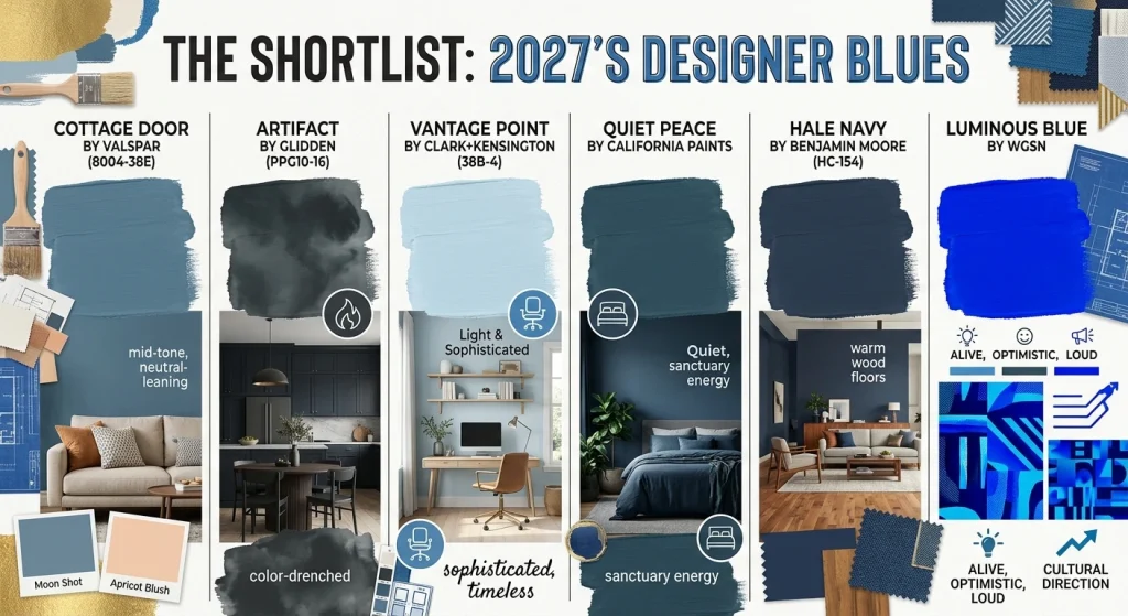
Cottage Door by Valspar (8004-38E): Valspar’s Color of the Year. Mid-tone, neutral-leaning, absurdly versatile for bedrooms, offices, and living rooms. Pairs with Moon Shot and Apricot Blush if you want a full palette.
Artifact by Glidden (PPG10-16): Warm and smoky. A “reset” color, as Glidden puts it. Cabinetry, color-drenched walls, anywhere you want calm with a spine.
Vantage Point by Clark+Kensington (38B-4): Light, sophisticated, and timeless enough that you won’t hate it in five years.
Quiet Peace by California Paints: Deep, moody, sanctuary energy. Bedrooms and dining rooms.
Hale Navy by Benjamin Moore (HC-154): Still the most specified navy out there. Slightly green-leaning undertone, which is why it looks best with warm wood floors. Honest opinion? It’s everywhere, and it’s a little safe. But it works, and it isn’t going anywhere.
Luminous Blue by WGSN: Not a wall color for most of us. But WGSN’s 2027 pick signals where blue is heading culturally: alive, optimistic, and loud. Worth watching.
What to Pair With Blue (The Part That Makes or Breaks It)
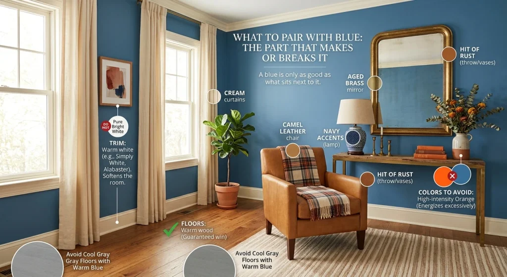
A blue is only as good as what sits next to it.
Trim: Warm white, always. Pure bright white makes blue look colder and harsher. Something like Benjamin Moore’s Simply White or Sherwin-Williams’ Alabaster softens the whole room without going yellow.
Floors: Warm wood and blue are basically a guaranteed win. Cool gray floors fight warm-leaning blues, so if you’re working with gray, go cooler and grayer with your blue to match.
Accents: Cream, camel leather, and aged brass warm up a cool blue. Navy plus white plus a hit of rust is about as foolproof as interiors get.
Colors to avoid: Orange and blue are complements, which means they energize each other. Sometimes that’s exactly what you want. Usually it’s not.
Trends Worth Your Attention
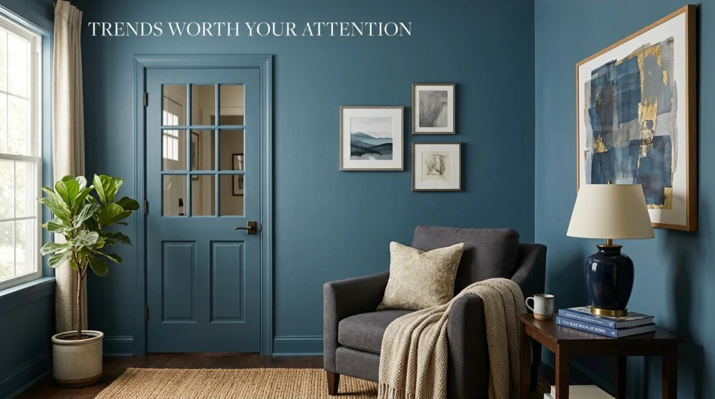
Blue as the new neutral. This is the big one. Mid-tone blues are replacing gray as the “I want something interesting but not scary” backdrop. Cottage Door is the clearest example.
Complexity over purity. Flat, one-note blues are out. Designers want undertones a whisper of green, a hint of gray that make a color feel custom rather than off-the-shelf.
Going deeper. Sherwin-Williams’ color team has said richer, darker hues are gaining traction and will stick around. They’re right. Dark blues photograph well, age well, and feel intentional.
Quick Answers
What’s the most popular blue for 2027?
Cottage Door by Valspar leads, with Artifact close behind.
Which blue makes a room look bigger?
Light ones. Vantage Point, pale sky blues, powder blue. Matte finish helps.
Is blue still in style?
Five major brands picked blue this year. Yes.
What blue goes with wood floors?
Warm-leaning blues: Cottage Door, Artifact, Hale Navy. Cool blues fight with warm floors. Don’t do that to yourself.
What sheen should I use for blue paint?
Use matte for depth and hiding flaws, and satin in kitchens and bathrooms where you need to scrub. Eggshell is the middle ground most people land on.
Does blue paint make a room feel cold?
Only if you let it. Warm whites on the trim, warm wood on the floor, and a blue with a green or gray lean keep it comfortable.
Last Thing
Blue in 2027 isn’t a trend you’ll regret. It’s the color people come home to. Pick your shade, sample it, and sit with it for a few days. Then commit.
Want to see these side by side? We’ve curated 2027 blue palettes waiting for you at paintpallete.com.