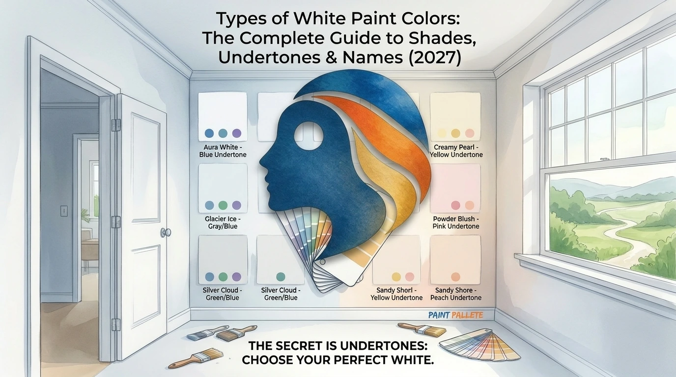
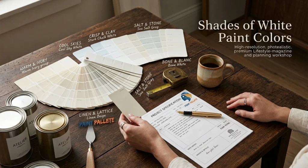
I am going to be honest with you. The first time I tried to pick a white paint color, I stood in the aisle for forty-five minutes, grabbed the brightest one on the shelf and painted my entire living room with it.
It looked like a dentist’s office. My wife did not say anything for two days. That silence told me everything I needed to know.
Here’s the thing nobody tells you: shades of white paint colors are not the same. They are not even close. That crisp white you loved at your friend’s house? It might make your bedroom look like a storage unit. That cozy cream from the hotel lobby? Could turn your kitchen into a yellow cave by 4 p.m.
So let me save you the three repaints I went through. Grab a coffee. This is the guide I wish existed back then.
Why Shades Of White Paint Messes With Your Head
White seems simple. It’s the absence of color, right? Wrong.
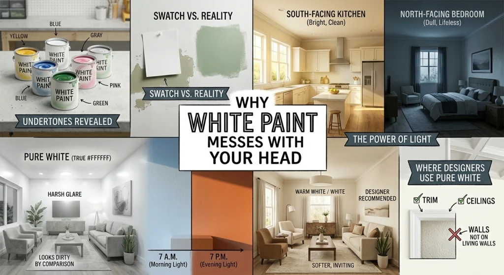
Every white paint on the shelf has a tiny bit of pigment hiding in it, yellow, gray, blue, pink, green you name it. On a little paper swatch, you cannot see it. On your walls, under your specific lighting, at 7 a.m. versus 7 p.m.? Oh, you will see it.
The same shade that looks clean and bright in a south-facing kitchen can turn dull and lifeless in a north-facing bedroom. Light is the invisible force that determines what you actually see on your walls. It’s brutal, and it’s why so many people end up frustrated.
There’s also this myth that pure white paint like, actual #FFFFFF white is the “safest” choice. It’s not. Pure white on walls is harsh. It glares. It makes furniture look dirty by comparison.
Almost nobody should paint an entire room in true white. Designers use it on trim and ceilings, not on the walls where you actually live.
Warm Whites vs. Cool Whites: The Only Distinction That Actually Matters
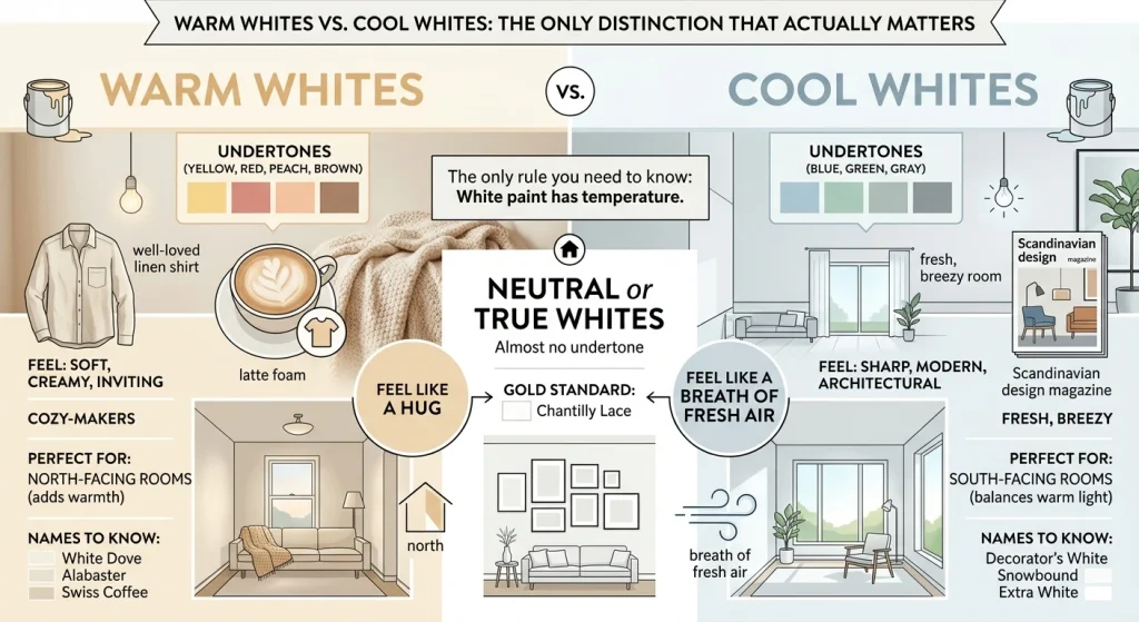
If you remember one thing from this article, make it this: white paint comes in three temperatures.
Warm whites have a splash of yellow, red, peach, or brown mixed in. They feel soft, creamy, and inviting.
Think of the color of a well-loved linen shirt, or the foam on a latte. These are your cozy-makers.
They work magic in north-facing rooms that never quite get enough sunlight. Names to know: White Dove, Alabaster, Swiss Coffee.
Cool whites carry hints of blue, green, or gray. They look sharp, modern, and a little bit architectural.
If you want your space to feel fresh, breezy, or like a Scandinavian design magazine, this is your lane.
They’re perfect for south-facing rooms that get flooded with warm afternoon light—the cool tone balances it out so the room doesn’t turn yellow. Names to know: Decorator’s White, Snowbound, Extra White.
Neutral or true whites have almost no undertone at all. They are clean, crisp, high-contrast—basically a gallery wall for your life.
Chantilly Lace is the gold standard here. It reads as pure white in almost any light, which is exactly why designers love it.
Quick gut check: do you want your room to feel like a hug or like a breath of fresh air? Warm whites hug. Cool whites breathe.
The 10 White Paint Shades Designers Keep Coming Back To
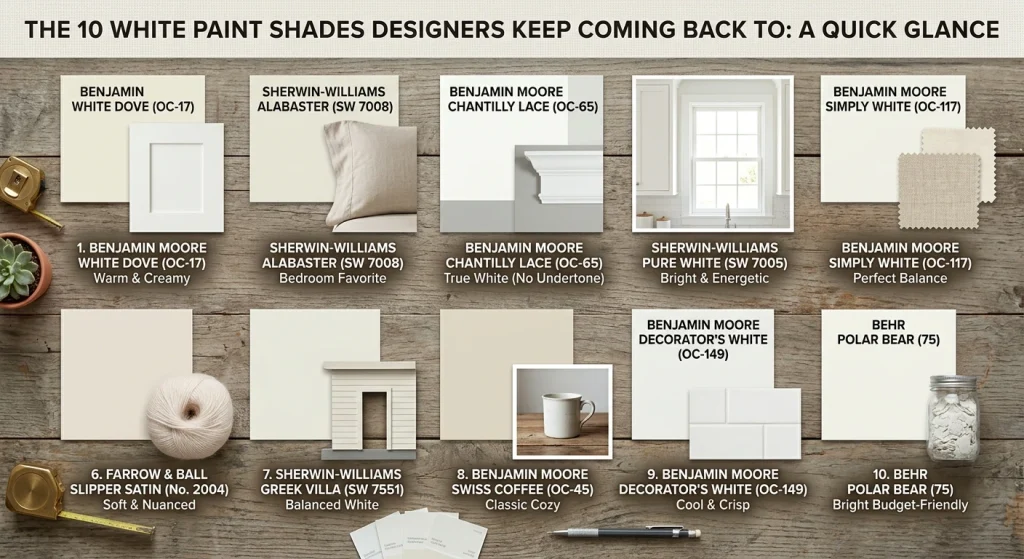
I’ve tested a lot of these on actual walls some in my own home, some in friends’ homes I helped repaint, some in client projects. Here’s the honest breakdown.
1. Benjamin Moore White Dove (OC-17) — The most popular white paint in America, and for good reason. It’s warm and creamy with soft yellow undertones, but on the wall it just reads as “white.” Not yellow. Not beige. Just… right. Use it anywhere. Cabinets, walls, trim, ceilings. If you cannot decide, start here.
2. Sherwin-Williams Alabaster (SW 7008) — My personal favorite for bedrooms. It’s creamy and warm without tipping into yellow, and it has just enough depth that it doesn’t feel flat. Everything looks good against it. Photographs beautifully, too.
3. Benjamin Moore Chantilly Lace (OC-65) — The cleanest, truest white in the game. Zero undertone. When you want white that reads as pure white in any light, this is the one. Fair warning: on walls, it can feel a little clinical. I use it on trim and ceilings almost exclusively.
4. Sherwin-Williams Pure White (SW 7005) — Bright and energetic with a whisper of warmth. It wakes a space up. Kitchens love it.
5. Benjamin Moore Simply White (OC-117) — Sits right between White Dove and Chantilly Lace. Warmer than a true white, not as creamy as White Dove. Ideal when you want a hint of warmth without commitment.
6. Farrow & Ball Slipper Satin (No. 2004) — Expensive, yes. Worth it? Also yes. It’s incredibly soft and nuanced, never stark or sterile. It’s the paint equivalent of a really good cashmere sweater.
7. Sherwin-Williams Greek Villa (SW 7551) — One of those rare whites that isn’t gray, yellow, cold, or blue. It’s just balanced. Great on exteriors.
8. Benjamin Moore Swiss Coffee (OC-45) — A classic warm off-white. Cozy without being heavy. This is the color of my aunt’s farmhouse kitchen and I’ve been chasing that vibe ever since.
9. Benjamin Moore Decorator’s White (OC-149) — Cool, crisp, with a subtle blue-gray undertone. Fresh and modern. My go-to for contemporary bathrooms.
10. Behr Polar Bear (75) — A bright, clean, budget-friendly white. I have used it on more ceilings than I can count.
Room-by-Room: What Actually Works

I’m not going to pretend there’s one perfect white for every room. There isn’t.
Kitchens want crisp, bright whites that bounce light around. Chantilly Lace or Pure White. Pair them with marble and stainless and you’re golden.
Bathrooms need a touch of warmth or they feel like gas stations. White Dove or Swiss Coffee. Trust me.
Bedrooms should feel like a soft landing. Alabaster or Simply White. Nothing cool or stark you are trying to sleep in there, not perform surgery.
Living rooms can handle something with a little gray or greige in it. Decorator’s White. Classic Gray. Something that plays nice with your furniture and doesn’t compete.
How to Test White Paint Without Losing Your Mind
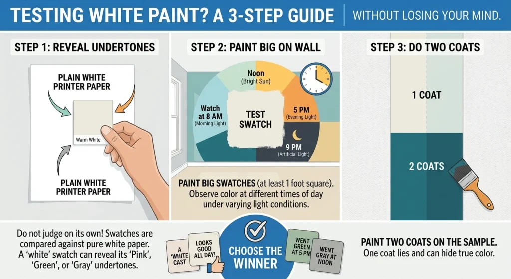
Do not – I repeat, do not judge a paint swatch on its own. Your eyes get tricked. They have nothing to compare it to.
Here’s my system: lay your swatches flat against a sheet of plain white printer paper. That pure, bright white paper will make the hidden undertones scream. Suddenly that “white” swatch is obviously pink. Or green. Or gray. It’s wild.
Then paint big swatches at least a foot square directly on your wall. Watch them at 8 a.m., at noon, at 5 p.m., and at 9 p.m. with the lights on. If a color looks good at all four, you have found your winner. If it turns weird at any point, walk away.
One more thing: paint two coats on the sample. One coat lies.
The Bottom Line
Picking from the endless shades of white paint colors is genuinely hard. Anyone who tells you otherwise has never done it.
But it’s not impossible. Start with your room’s natural light. Decide whether you want warm, cool, or neutral. Test your top three on the actual wall. And then commit.
The right white will make your furniture look better, your artwork pop, and your space feel like yours. The wrong one will make you repaint in six months. I know from experience.
Ready to stop guessing? Browse our full collection of white and off-white paint colors at PaintPallete.com. And if you have got a white paint horror story, I want to hear it, drop it in the comments. Misery loves company.