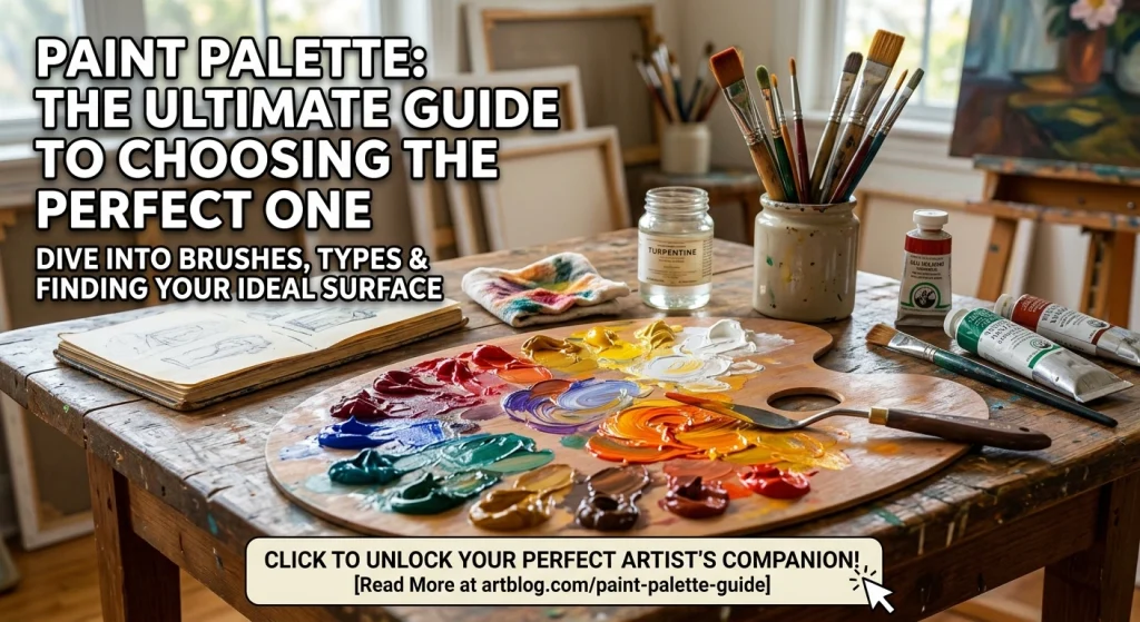
Four days ago, I blew fourteen bucks on a plastic paint palette at Michael’s.
Felt flimsy in my hand. I knew it was a mistake before I even left the checkout line.
By the time I squeezed out my first glob of ultramarine, the damn thing was already warping. Bowing in the middle like a sad taco. My white paint slid right off the edge and landed on my sneaker.
That’s when it hit me. Most artists including me for way too long, waste stupid money on the wrong tools. And it kills their flow.
So. Let’s fix that.
Here’s the hard truth about your palette
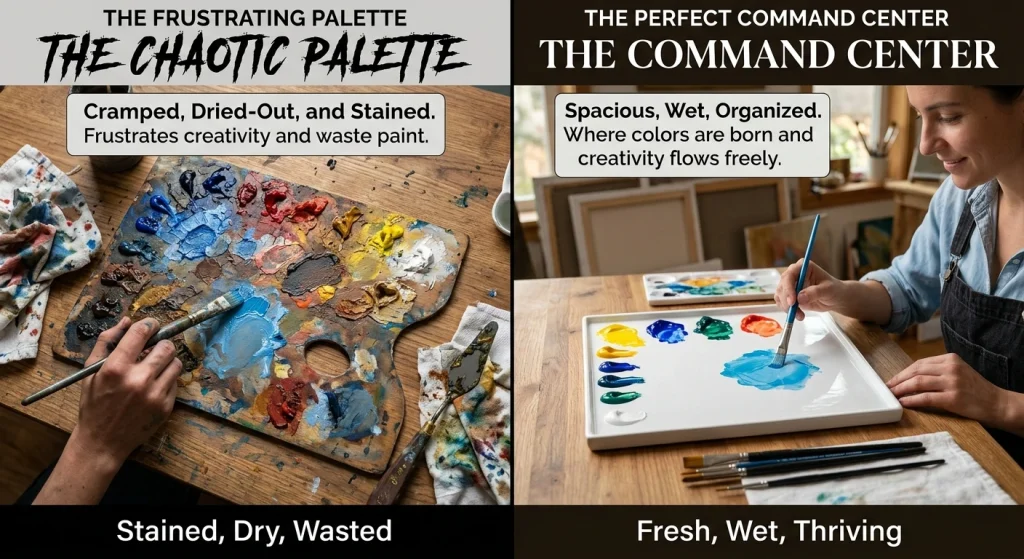
Your palette is not just a flat thing to hold goo.
It’s your command center. It’s where colors are born and where bad habits die. A garbage palette dries out your paint color blue before you can even mix it. It stains permanently. And it frustrates you so bad you wanna quit mid-session just to go watch Netflix.
But the right one?
Man, the right one disappears in your hand. You stop thinking about the plastic or the wood and just paint. That’s the whole goal.
The Types (And Which Ones Actually Suck)
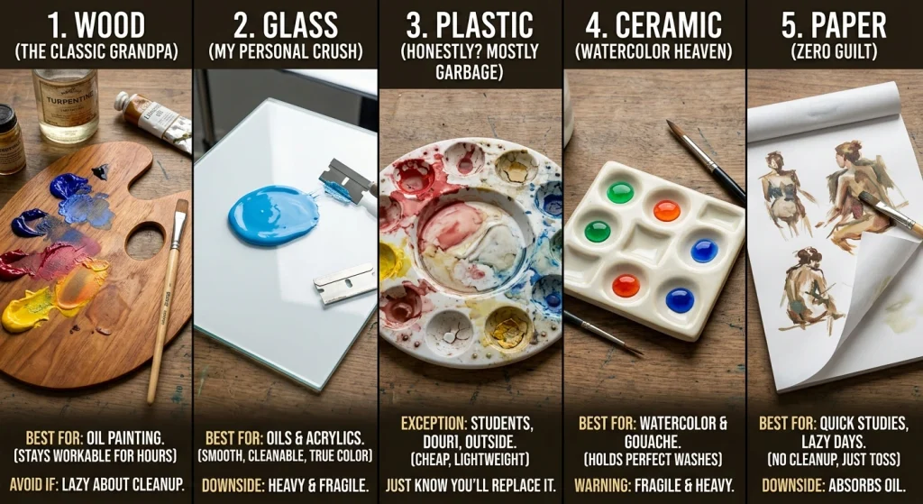
Let’s cut the marketing fluff. Here’s what really works.
Wood Palettes (The Classic Grandpa)
Okay, I love wood because It’s warm. It smells like turpentine and tradition. Oil painters swear by it because it breathes and your paint stays workable for hours instead of skinning over in ten minutes.
But here’s the kicker: Wood is high-maintenance. If you do not seal it right, it soaks up linseed oil like a sponge and ruins your mixes forever.
Best for: Oil painting.
Avoid if: You’re lazy about cleanup. Be honest with yourself.
Glass Palettes (My Personal Crush)
I switched to tempered glass two years ago and never looked back.
It’s smooth & dead flat. And you can scrape it clean with a razor blade in thirty seconds. It looks brand new every single session. Plus this pallete is huge and the neutral white background underneath does not trick your eyes. You see the real blue color paint you are mixing, not some distorted version reflecting off stained plastic.
Best for: Oils and acrylics.
Downside? It’s heavy. And if you drop it, you are sweeping up shards for an hour. Don’t be clumsy.
Plastic Palettes (Honestly? Mostly Garbage)
I said it.
Plastic palettes are cheap for a reason. They stain and warp. And that weird textured surface? It grabs your pigment and holds it hostage.
Exception: If you are a student on a shoestring budget, or you are painting outside and need something lightweight, fine. Get the cheap one. Just know you are gonna replace it in three months.
Ceramic (Watercolor Heaven)
Watercolorists, listen up.
Ceramic is your soulmate. The slightly porous surface holds water beads perfectly. Your washes stay juicy instead of beading up into ugly little circles.
Best for: Watercolor and gouache.
Warning: It’s fragile and heavy. Don’t take it camping.
Paper Palettes (Zero Guilt)
Sometimes I just want to paint and throw everything away. No cleanup. No scraping. Just tear, paint, toss.
Best for: Quick studies, workshops or those days when you are feeling lazy.
Downside: They absorb oil like crazy. If you are using heavy-bodied paint, your white paint will turn translucent. Gross.
How to Actually Pick One (My 4-Step Reality Check)
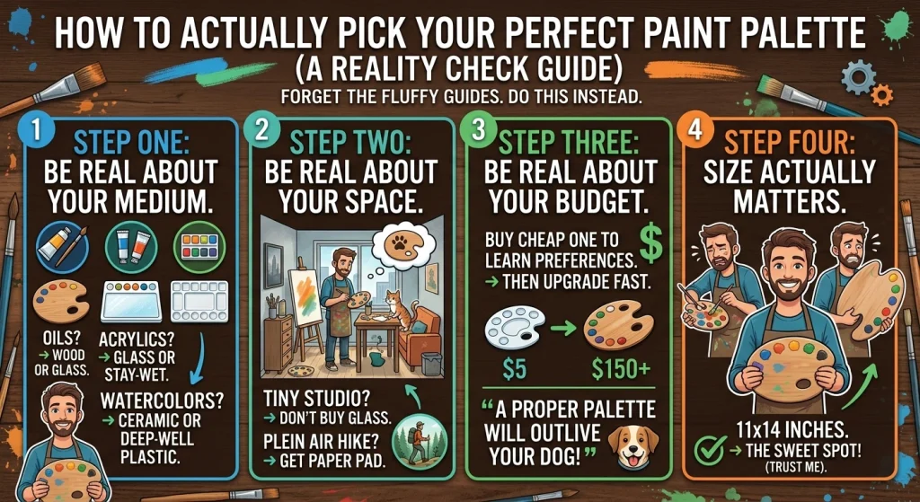
Forget the fluffy “buyer’s guides.” Do this instead.
Step one: Be real about your medium.
- Oils? Wood or glass. Period.
- Acrylics? Glass or a stay-wet palette.
- Watercolors? Ceramic or deep-well plastic.
Step two: Be real about your space.
Are you painting in a tiny studio apartment where your cat knocks everything over? Don’t buy glass. Are you a plein air nut who hikes into the woods? Buy a lightweight paper pad.
Step three: Be real about your budget.
You can spend five bucks or two hundred. Here’s my rule: Start cheap, upgrade fast. Buy the cheap one to figure out your preferences. Then invest in the good stuff. A proper palette will outlive your dog.
Step four: Size actually matters.
Too small? You are constantly fighting for real estate. Mixing gets cramped. Too big? You can’t hold it and paint at the same time.
11×14 inches. That’s the sweet spot. Trust me.
How to Arrange Your Colors (Stop Doing It Wrong)
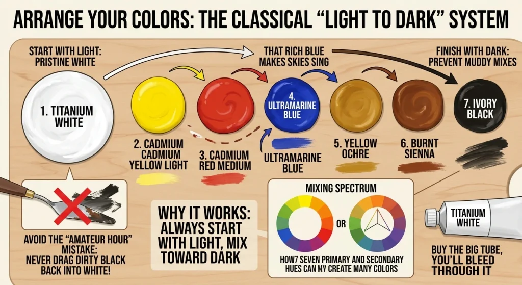
Alright. You have got your palette. Now what?
Here’s the classical system that actually works: Light to dark.
Put your white paint on the far left edge. Then arrange your hues in a rainbow, yellows, oranges, reds, purples and finally your darks on the far right.
Why? Because you always start with light and mix toward dark. You never—and I mean never drag a dirty brush full of black back into your pristine white paint. That’s amateur hour.
My go-to starter setup:
- Titanium White (buy the big tube, you’ll bleed through it)
- Cadmium Yellow Light
- Cadmium Red Medium
- Ultramarine Blue (that rich paint color blue that makes skies sing)
- Yellow Ochre
- Burnt Sienna
- Ivory Black
Seven colors. That’s it. You can mix the entire visible spectrum with these. And don’t overthink the exact blue blue paint shade ultramarine handles 90% of your cool mixing needs.
Mixing Like a Pro (Without Making Mud)
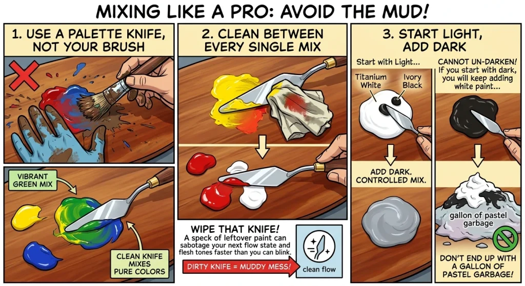
Mixing is not just squishing. It’s a craft.
Never use your brush to mix.
Grab a palette knife. A cheap metal trowel costs five bucks and saves your bristles from getting wrecked. Plus, it keeps your colors pure.
Clean between every single mix.
I don’t care if you are in a flow state. Stop. Wipe that knife. A speck of leftover paint color blue will sabotage your warm flesh tones faster than you can blink.
Start light, add dark.
You can always make a light mix darker. You cannot un-darken a dark mix. You will just keep adding white paint until you’ve got a gallon of pastel garbage.
Let’s Talk About Outdoor Paint (Because Why Not)
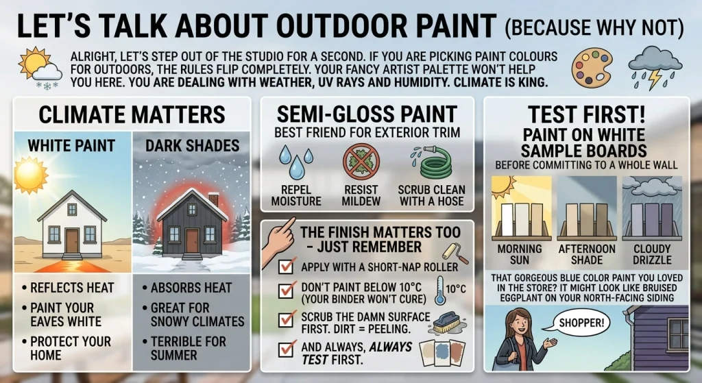
Alright, let’s step out of the studio for a second.
If you are picking paint colours for outdoors, the rules flip completely.
Your fancy artist palette won’t help you here. You are dealing with weather, UV rays and humidity.
Climate is king.
White paint reflects heat. If you live in Arizona, paint your eaves white or they will cook. Dark shades absorb heat, great for snowy climates, terrible for summer.
The finish matters too.
Semi gloss paints are your best friend for exterior trim. They repel moisture, resist mildew and scrub clean with a hose. Just remember:
- Apply with a short-nap roller
- Don’t paint below 10°C (your binder won’t cure)
- Scrub the damn surface first. Dirt = peeling.
And always, always test first.
Paint on white sample boards before committing to a whole wall. Watch them in morning sun, afternoon shade and cloudy drizzle. That gorgeous blue color paint you loved in the store? It might look like bruised eggplant on your north-facing siding.
Cleanup (The Part We All Hate)
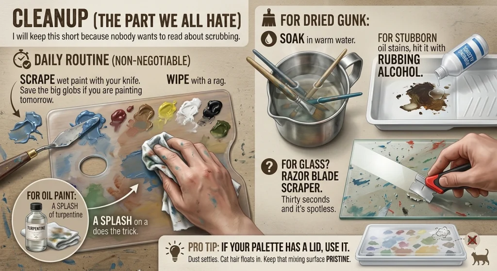
I will keep this short because nobody wants to read about scrubbing.
Daily routine (non-negotiable):
- Scrape wet paint with your knife. Save the big globs if you are painting tomorrow.
- Wipe with a rag.
- For oil paint, a splash of turpentine on a cloth does the trick.
For dried gunk:
- Soak in warm water.
- For stubborn oil stains, hit it with rubbing alcohol.
- For glass? Razor blade scraper. Thirty seconds and it’s spotless.
Pro tip: If your palette has a lid, use it. Dust settles. Cat hair floats in. Keep that mixing surface pristine.
Final Thought (And a Spoiler)
Your palette is not going to make you a great painter.
I know, I know. You wanted a magic bullet. But the truth is, the best palette in the world just removes friction. It gets out of your way.
The art? That’s still on you.
So go ahead. Buy the wrong one first. Watch it crack. Get mad. Then buy the glass one or the wood one. Feel the difference.
Because every painter has to go through this weird, expensive rite of passage.
And whether you spell it “palette” like the French or “pallete” like my quirky little domain name, what really matters is what you squeeze out of that tube and onto that surface.
Now stop reading. Go make a mess.
P.S. — I am still scrubbing that white paint off my sneaker from last week. Some lessons stain harder than others. 🎨